Chaparral Pro Type Specimen
Drake Rorabaugh --- 2019Print/Typography
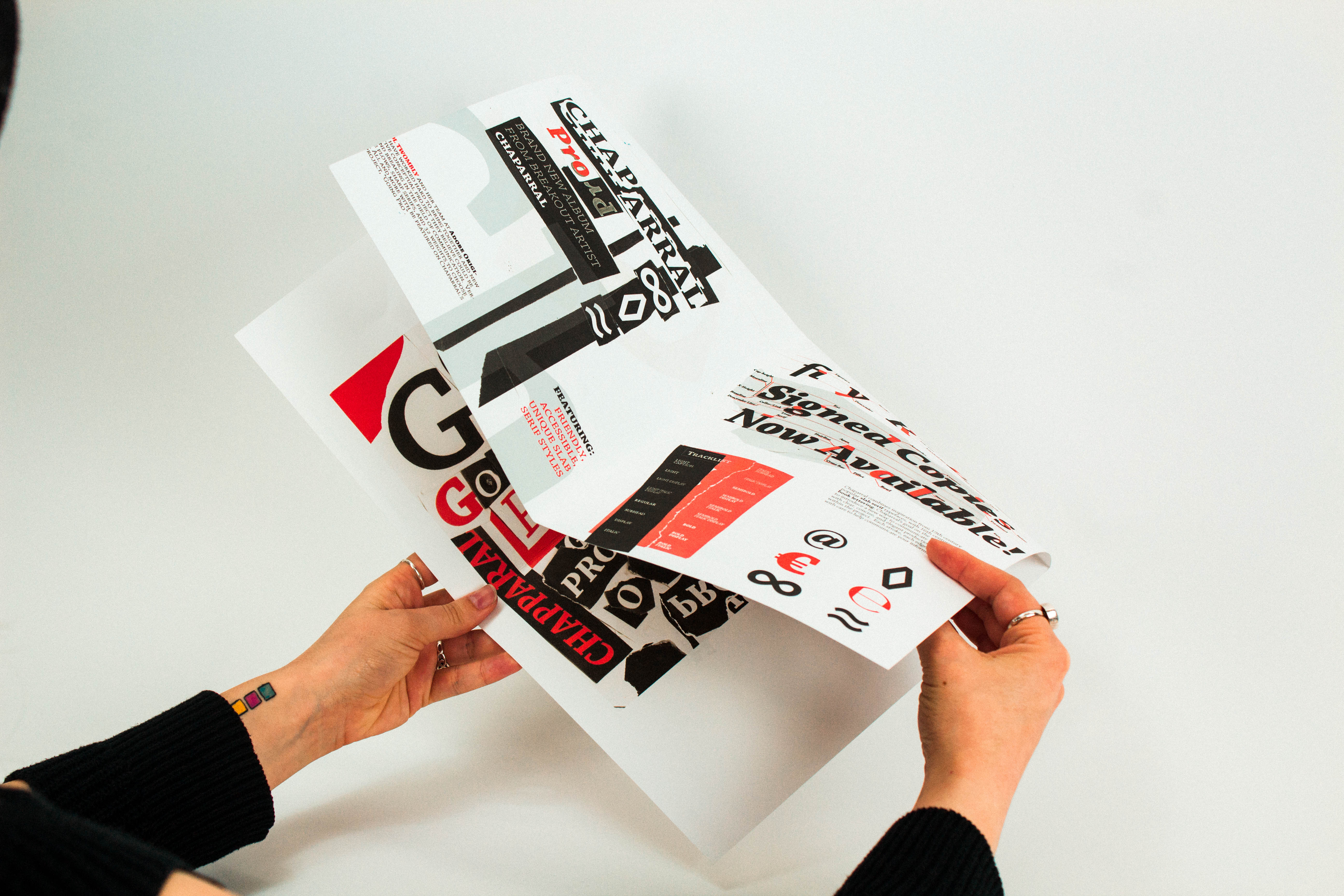
For this project, I wanted to design a specimen for Chapparal Pro that took it out of it’s normal formal context, and showed it being used in a new and different style then it typically lends itself to. I came up with the concept that the artist “Chapparral” was coming out with an album titled “Going Pro” to give it a bit more flavor, and reinforce this unusual presentation that would bring the typeface a new life.
This project really challenged my handle on abstract typography,and displaying old ideas in new and unique ways. I wanted to display the information in very bombastic and graphic way that stuck with the viewer afterwards.
01 Cover

02 Inside Spread

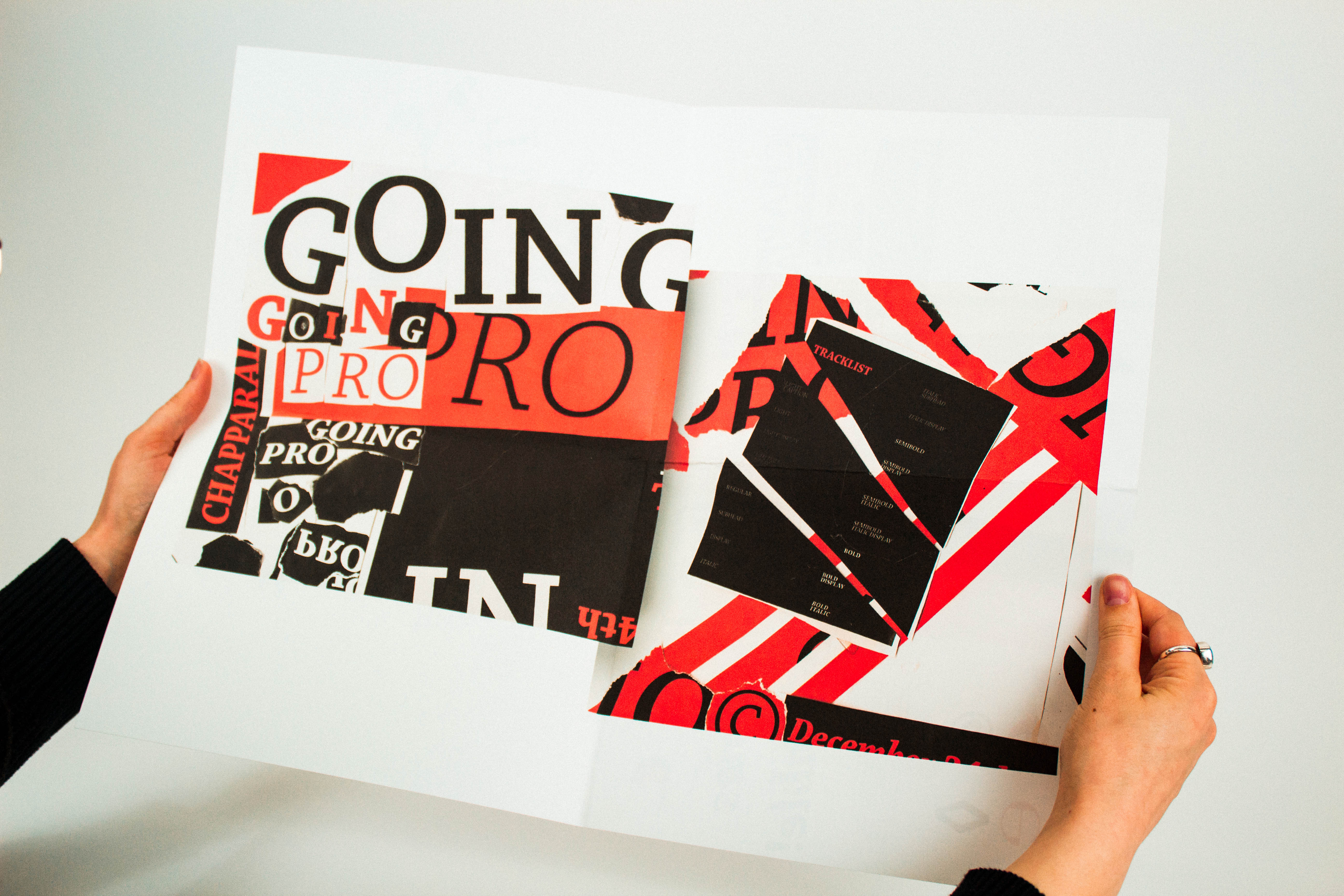
03 Spread to Poster
04 Poster Design
05 Back Cover

06 Poster Display

I wanted to have the poster design reflect the vehicle of the the album release, and also reuse elements such as the tracklist being a list of the wieghts. The poster also needed to act as incentive for the viewer to keep the peice, and reference it or display it.
07 Process Imagery
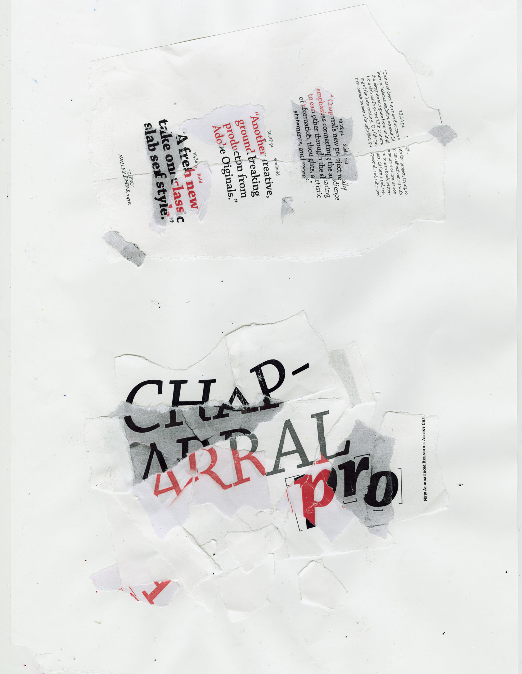
08 Process Scans

When creating assets for the project I began printing the type at different weights, sizes, and colors. I set out beginning to tear apart and rebuild the words in a more unique vision. I wanted these to display a contrast from what you’d expect from the slab-serif at first glance.
︎