Club 31
Drake Rorabaugh, Josh Judin, Anthony Williams --- 2020Branding/Video/Photography
Together with fellow designers Anthony Williams and Josh Judin, I contributed to the rebranding of a local club in Kansas City. This project aimed to support Black-owned businesses in the area by revamping the club's branding, signage, photography, and website.
We started by conducting a competitive audit of nearby clubs and bars to ensure our rebranding not only better represented the club's character but also stood out among the competition. After numerous meetings and revisions with the owner, we developed a branding system that delighted both the client and our team.
01 Project Summary/Presentation
To effectively convey the project's scope, we created a video summarizing the entire process and presenting each element.
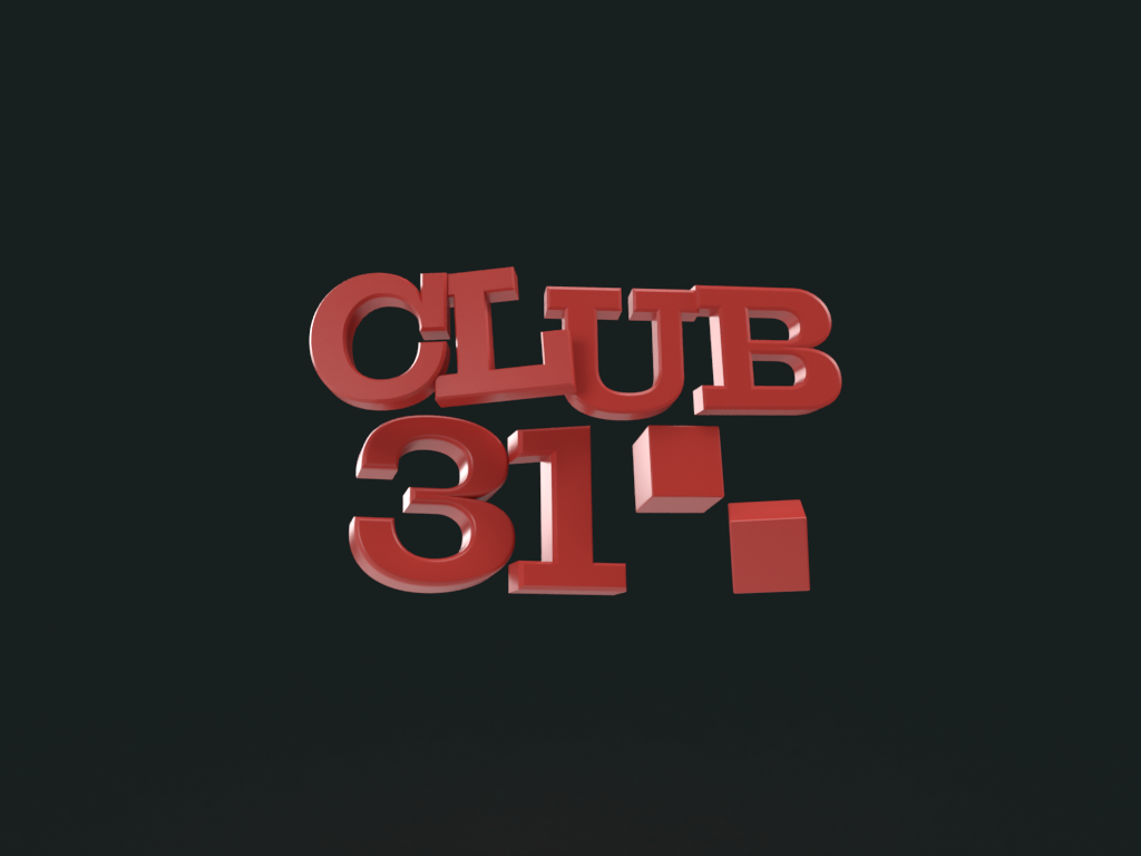
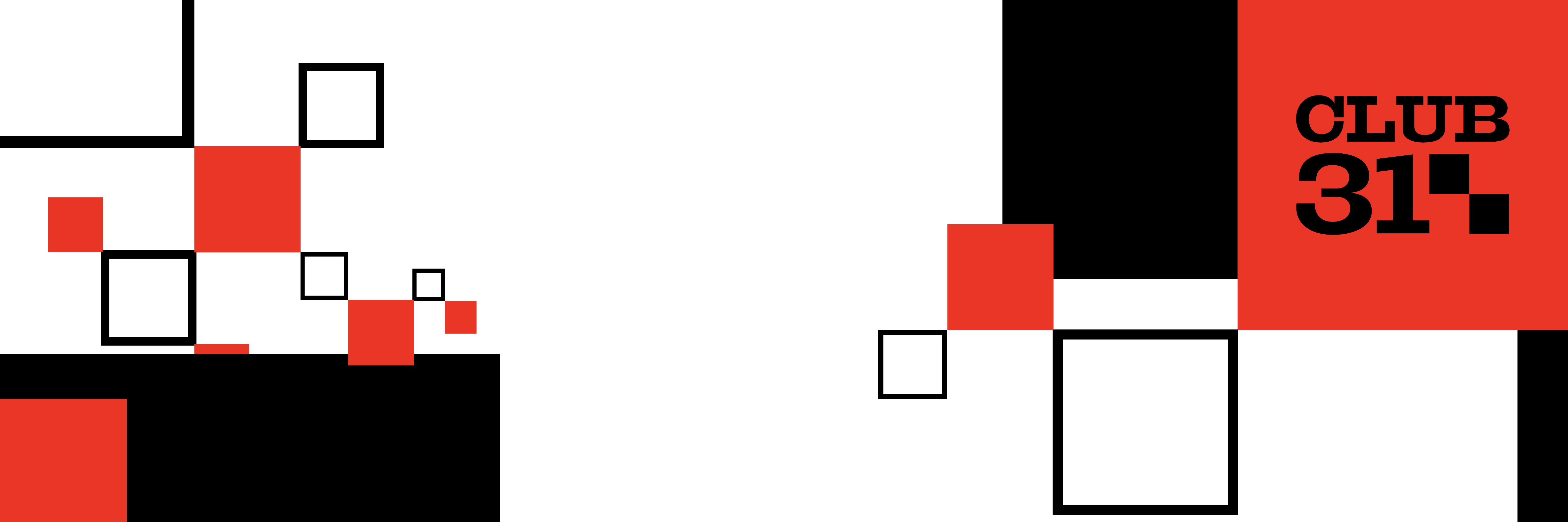
02 New Logo

The new logo features a checkered square pattern inspired by the racing industry's victory symbol, the checkered flag. As a racing and sports-themed bar, this motif was essential to the branding.
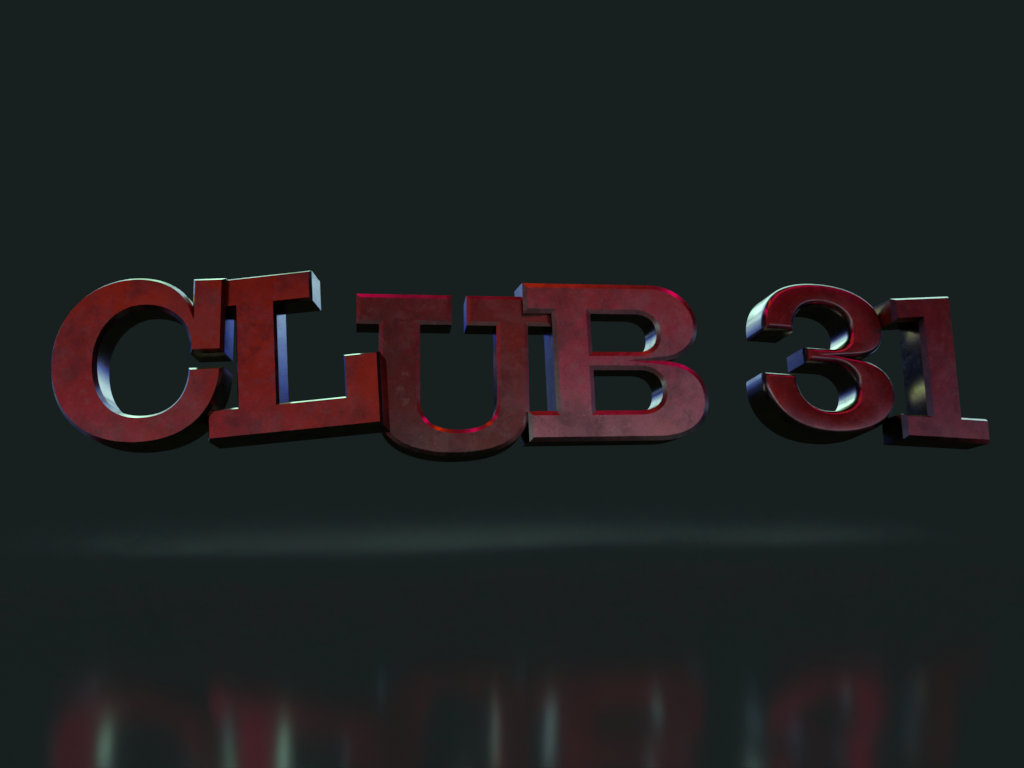
03 Old Logo
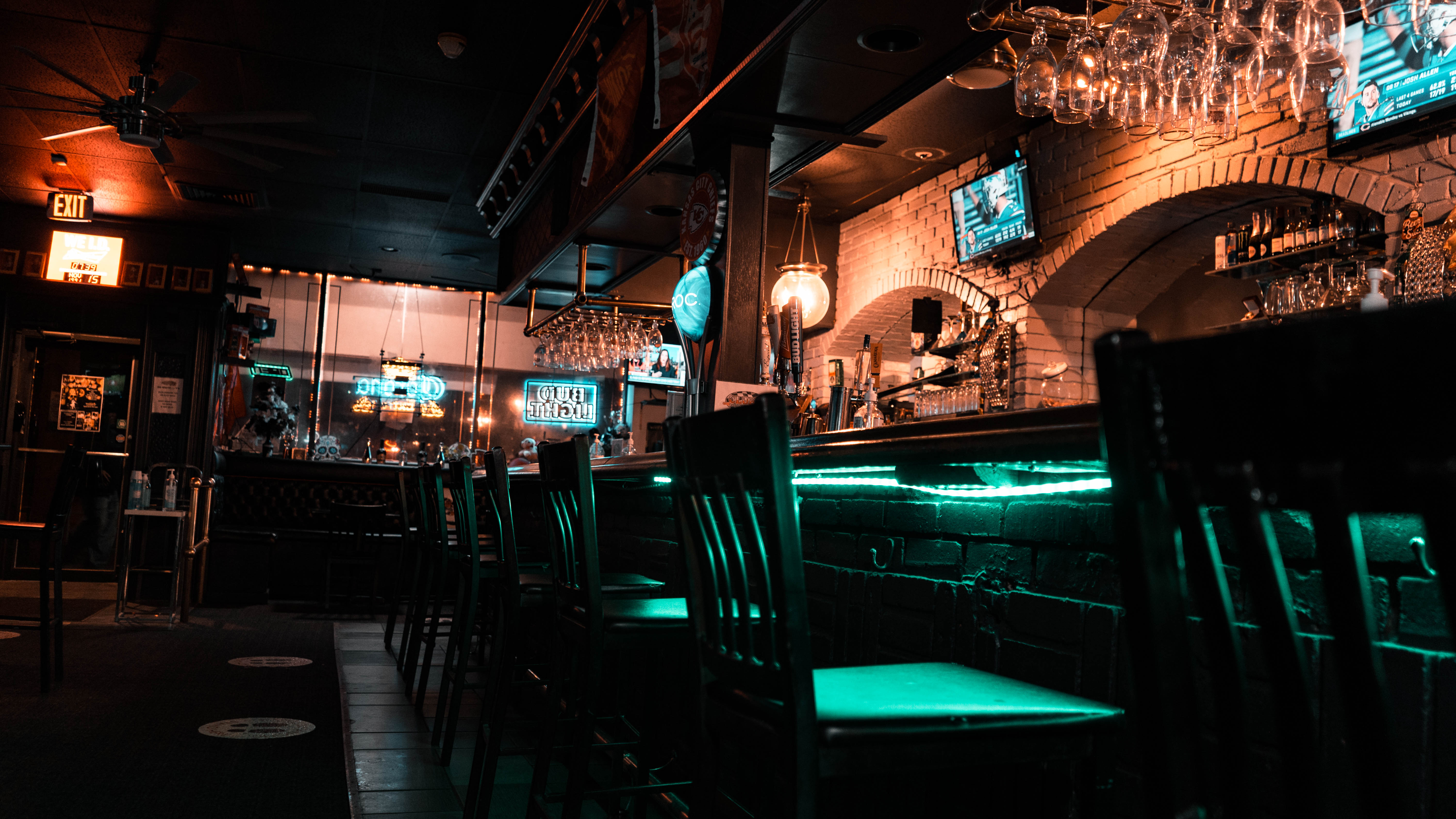
Displayed here is the club's old logo for comparison. We decided to build upon the racing flags present in the original branding while updating it for a more modern and accessible context.
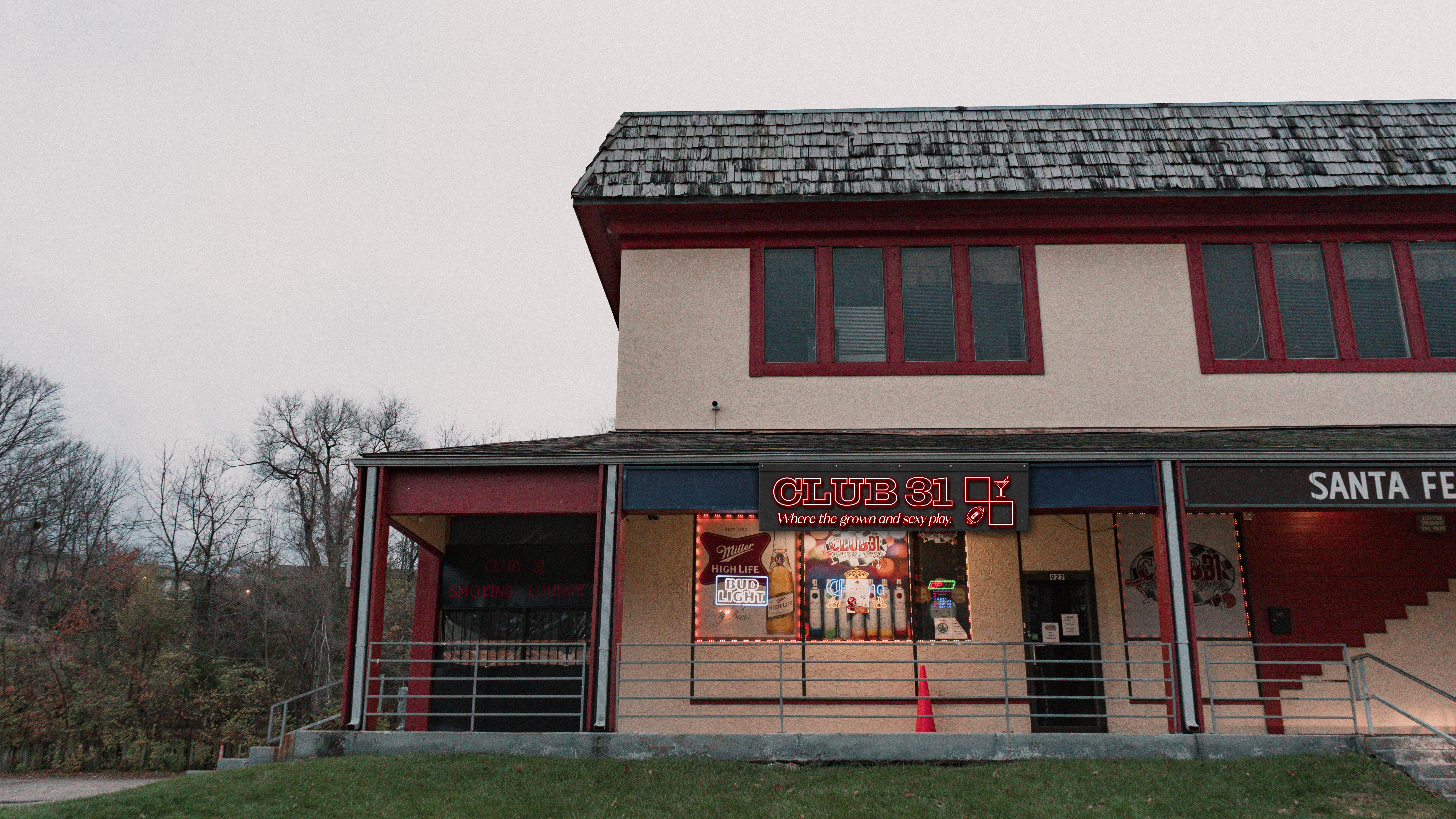
05 New vs. Old Signage

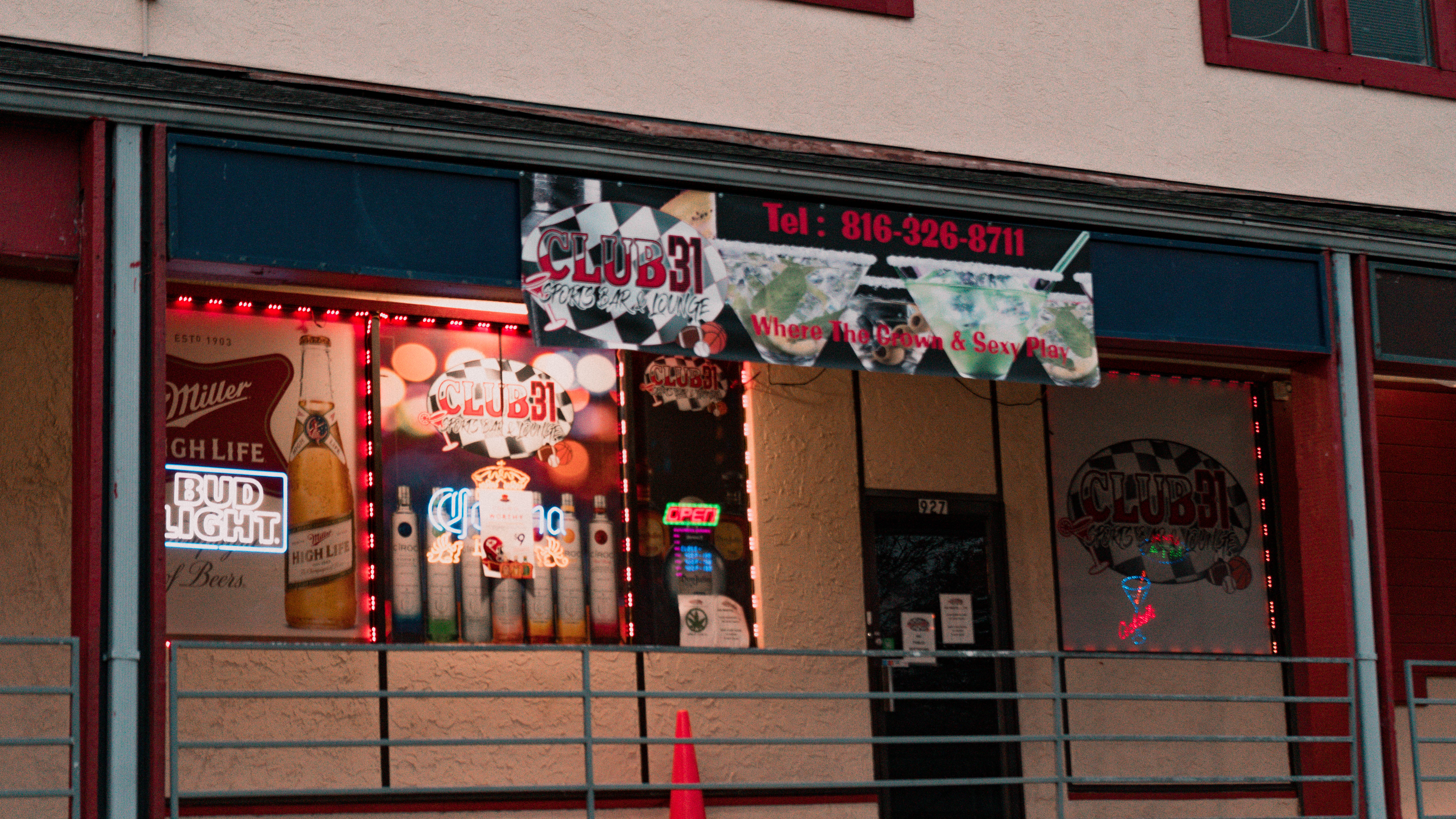
The revamped signage needed to be bold and easily visible from the road, unlike the previous prints. We ensured it carried visual weight and remained highly visible for new customers to easily locate the business.
06 Additional Signage

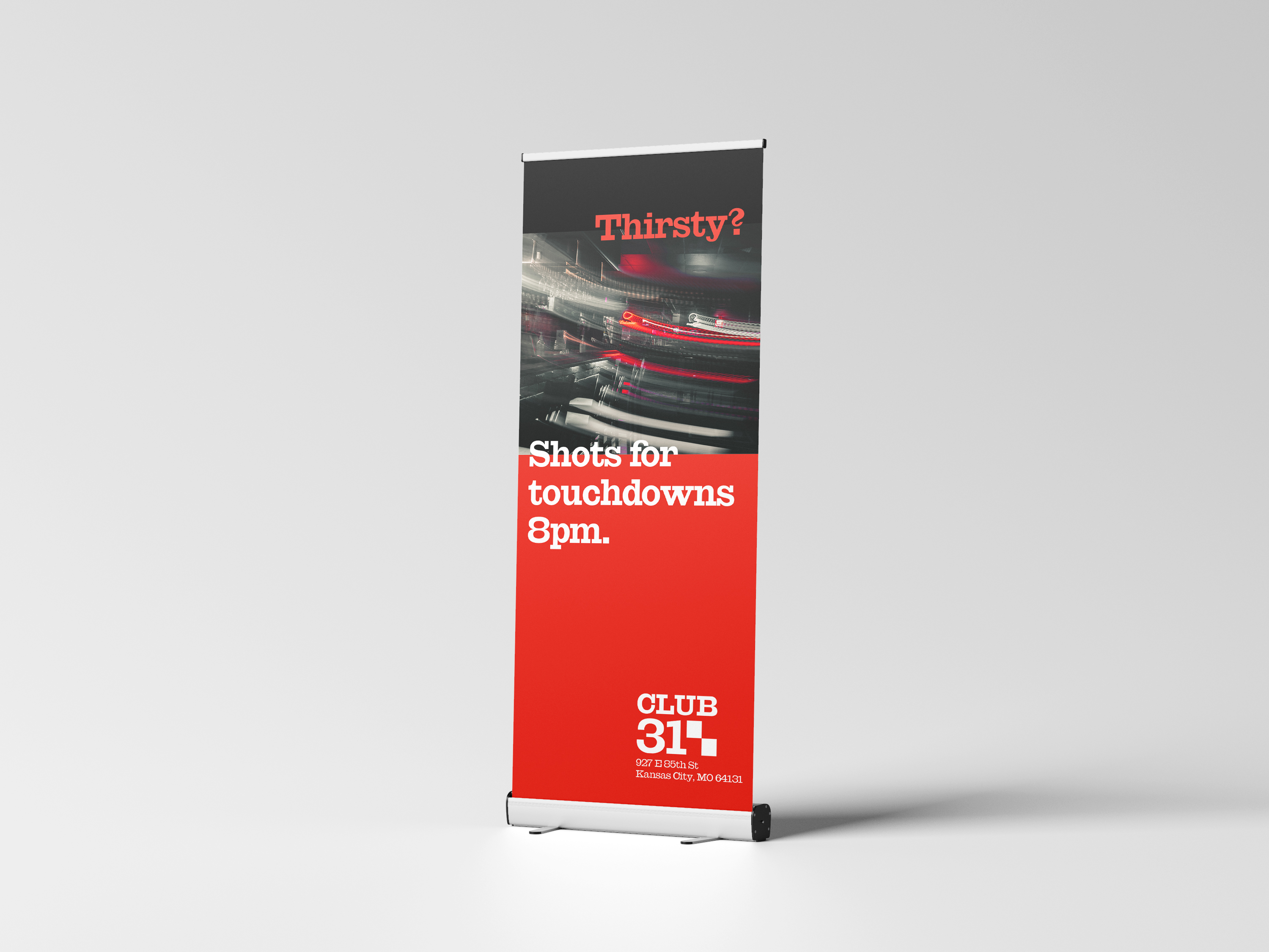

We aimed to incorporate the checkerboard pattern throughout all possible applications.
07 Location Photography and Advertisements
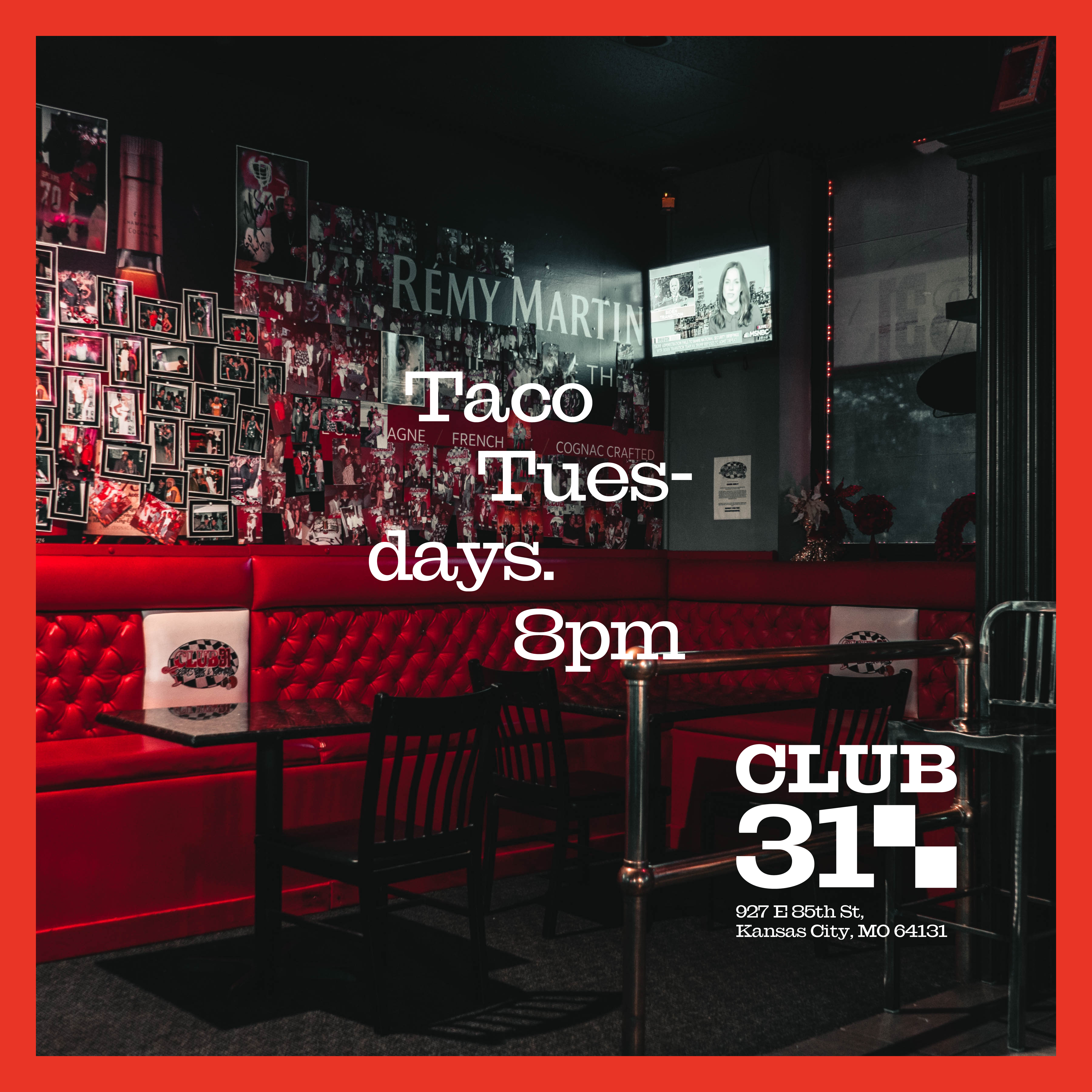
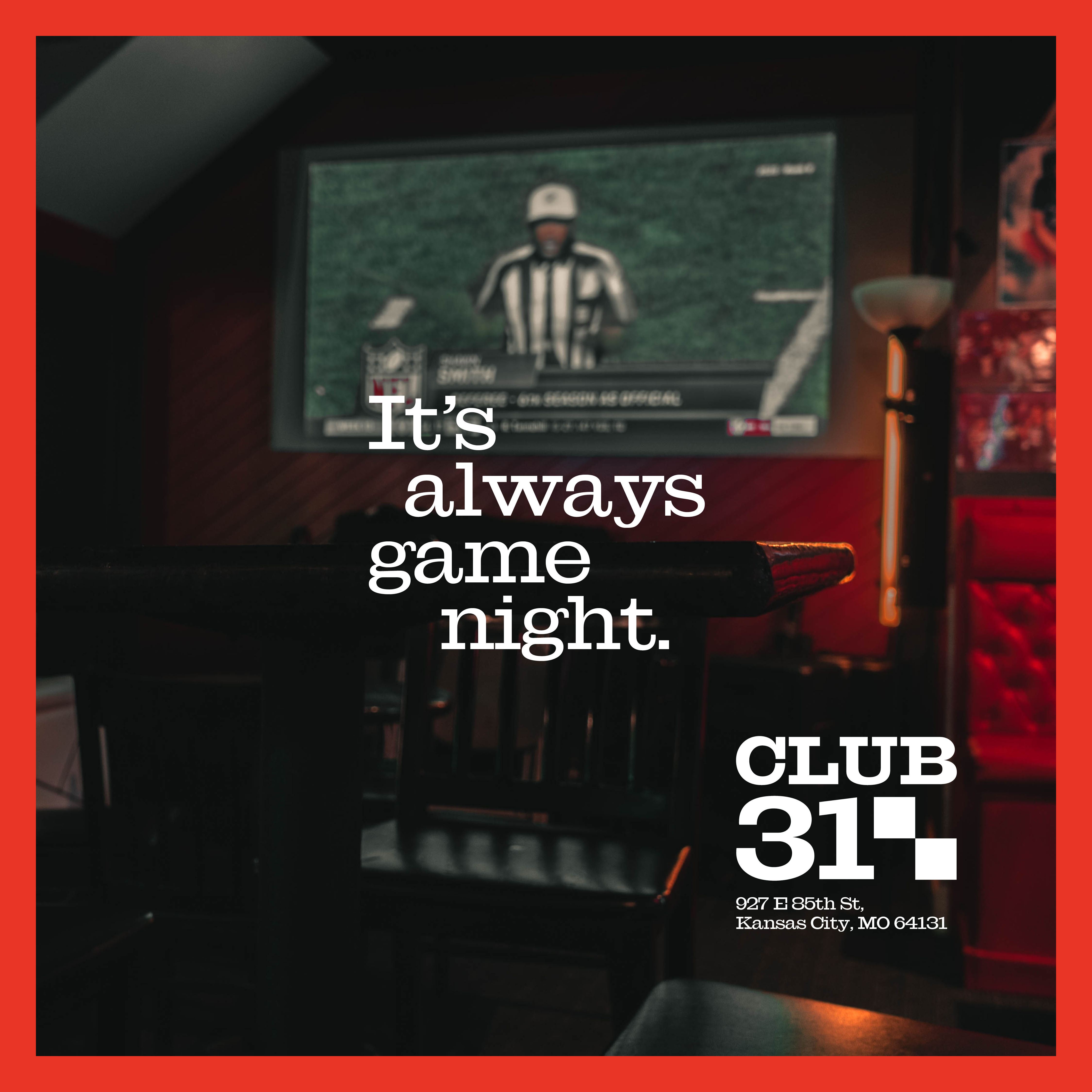
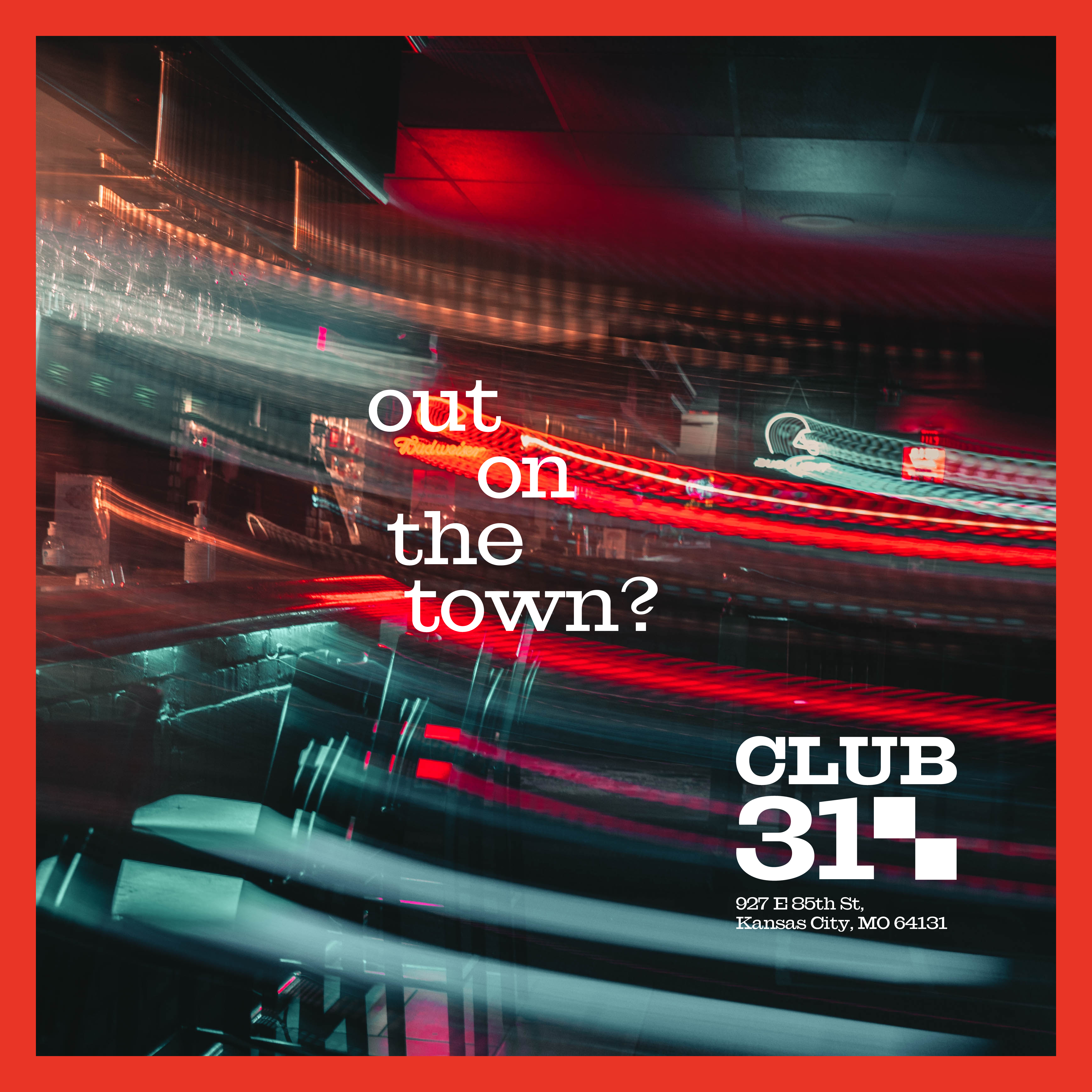
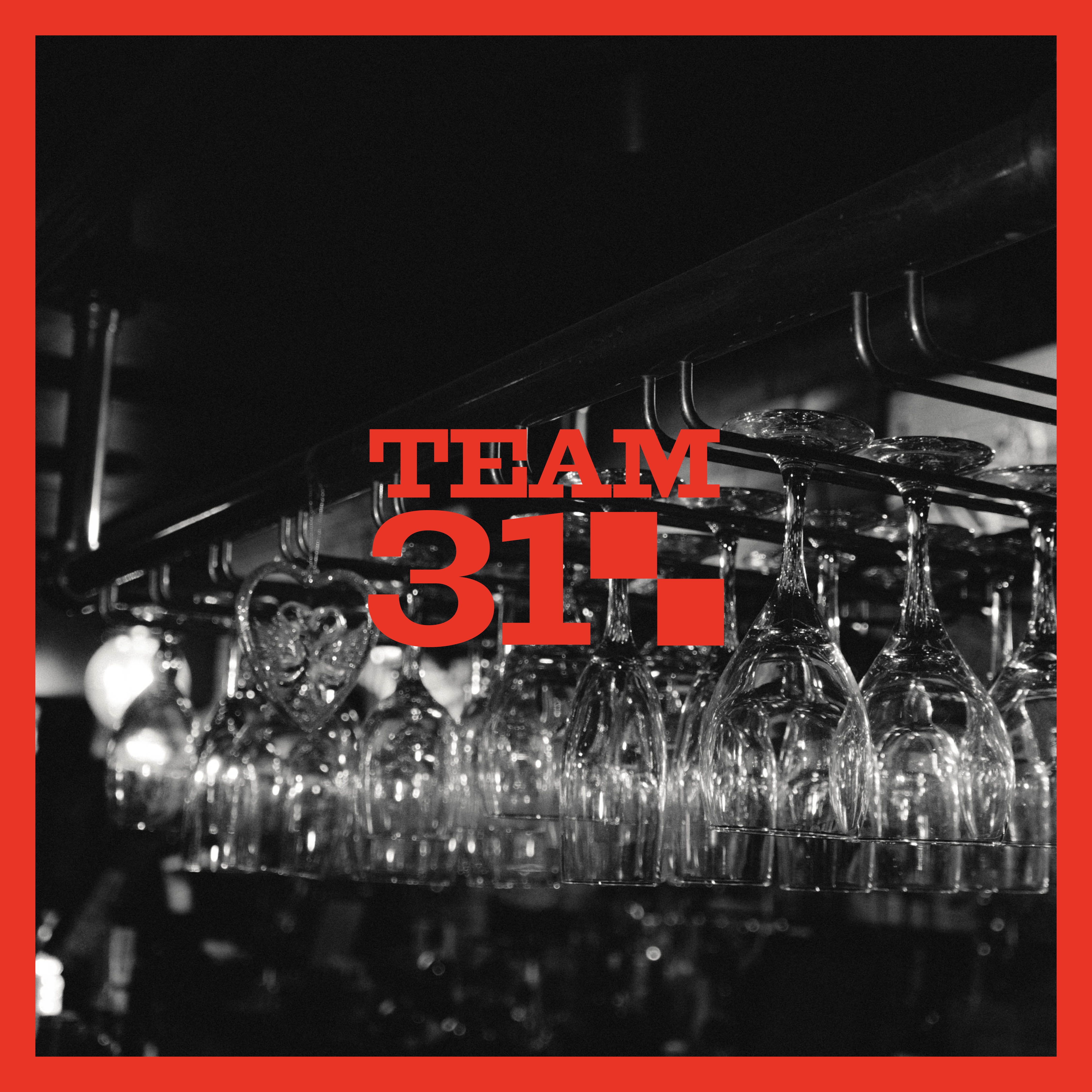
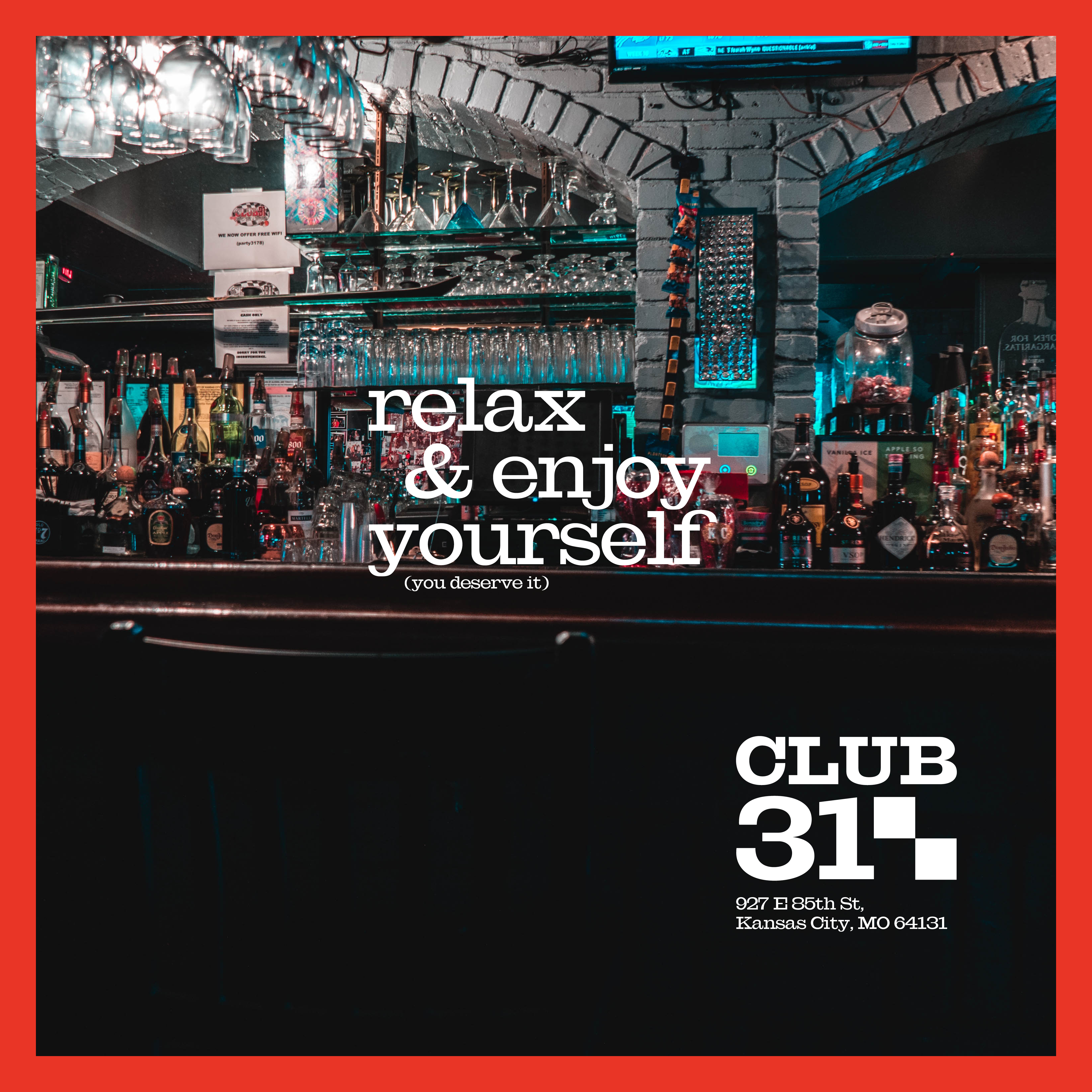
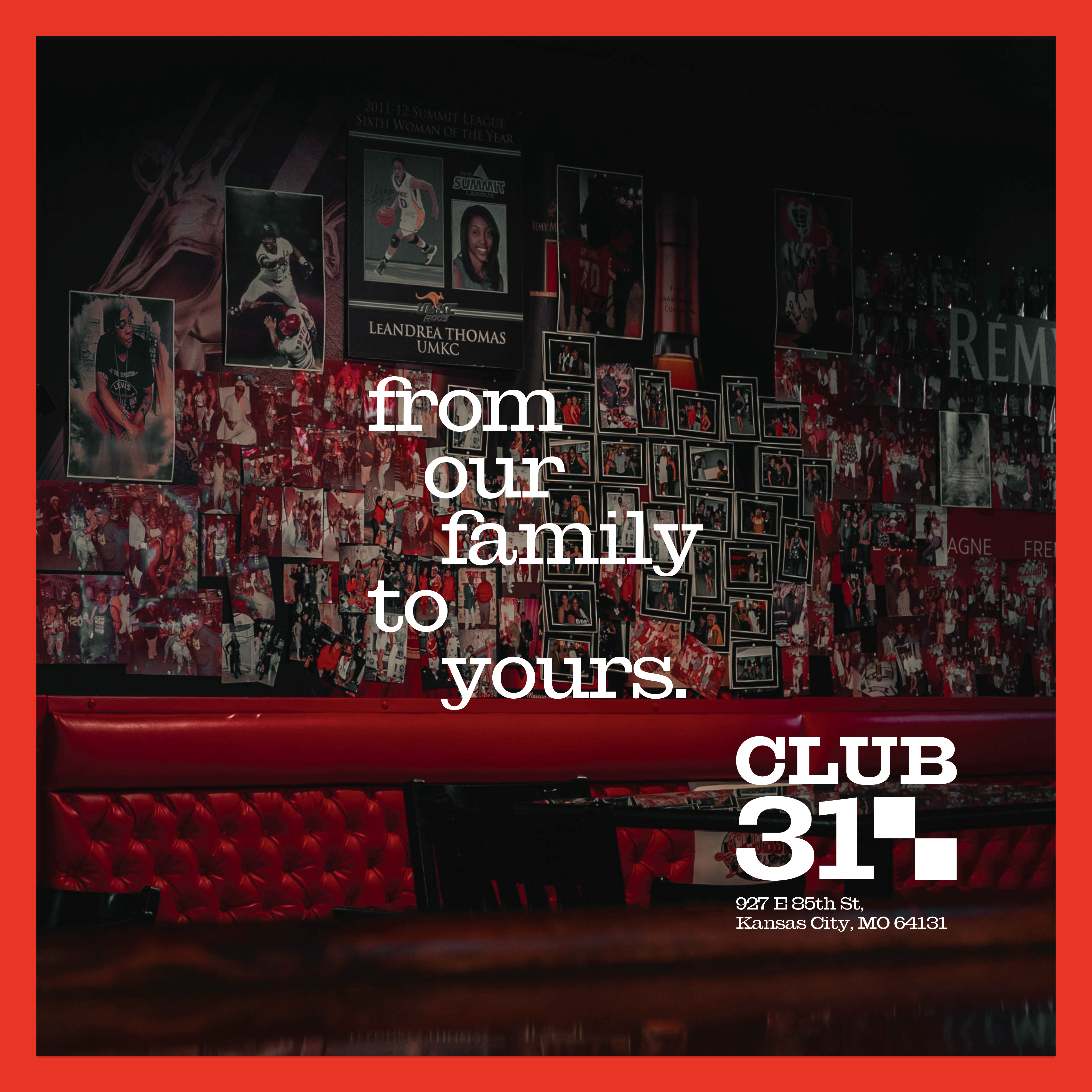
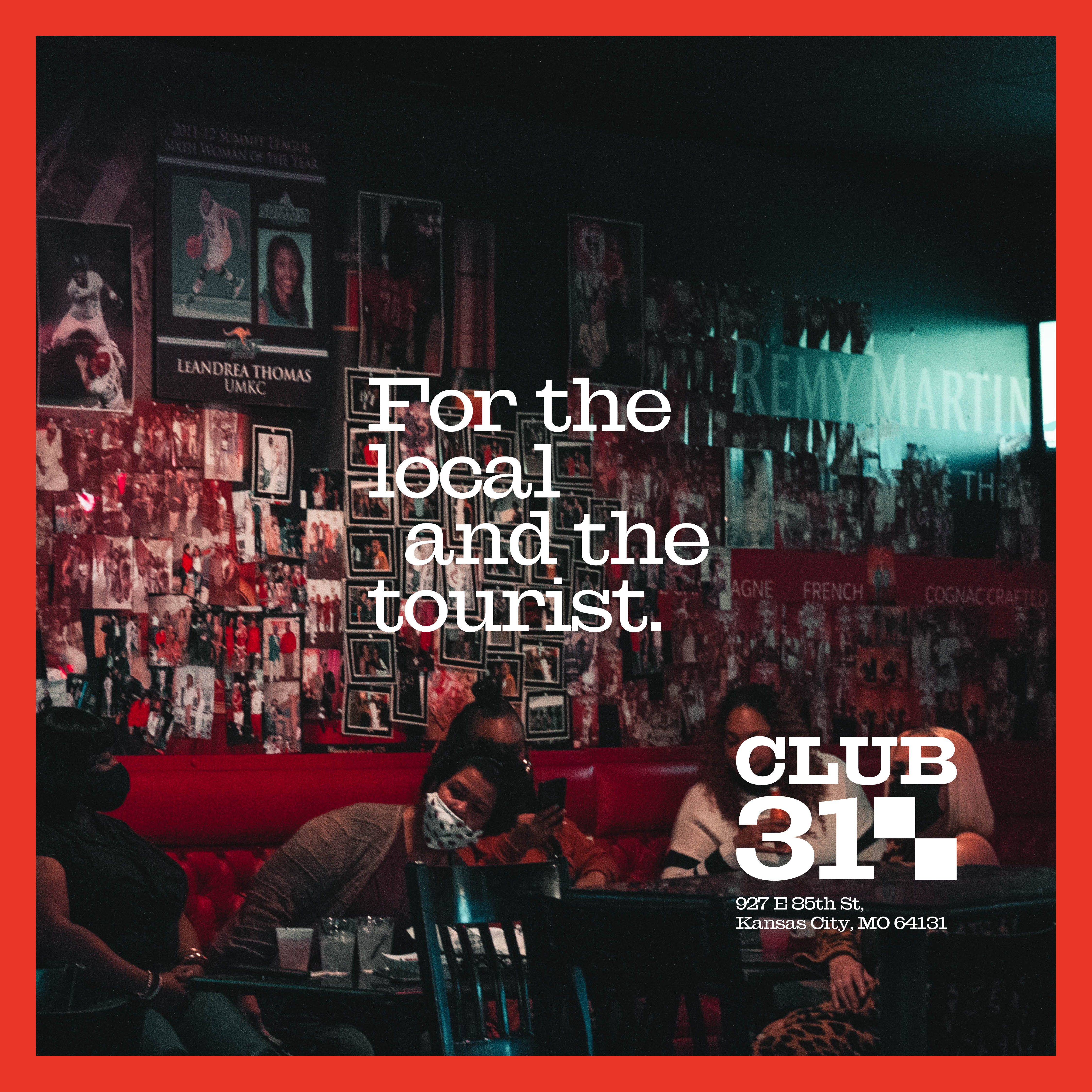

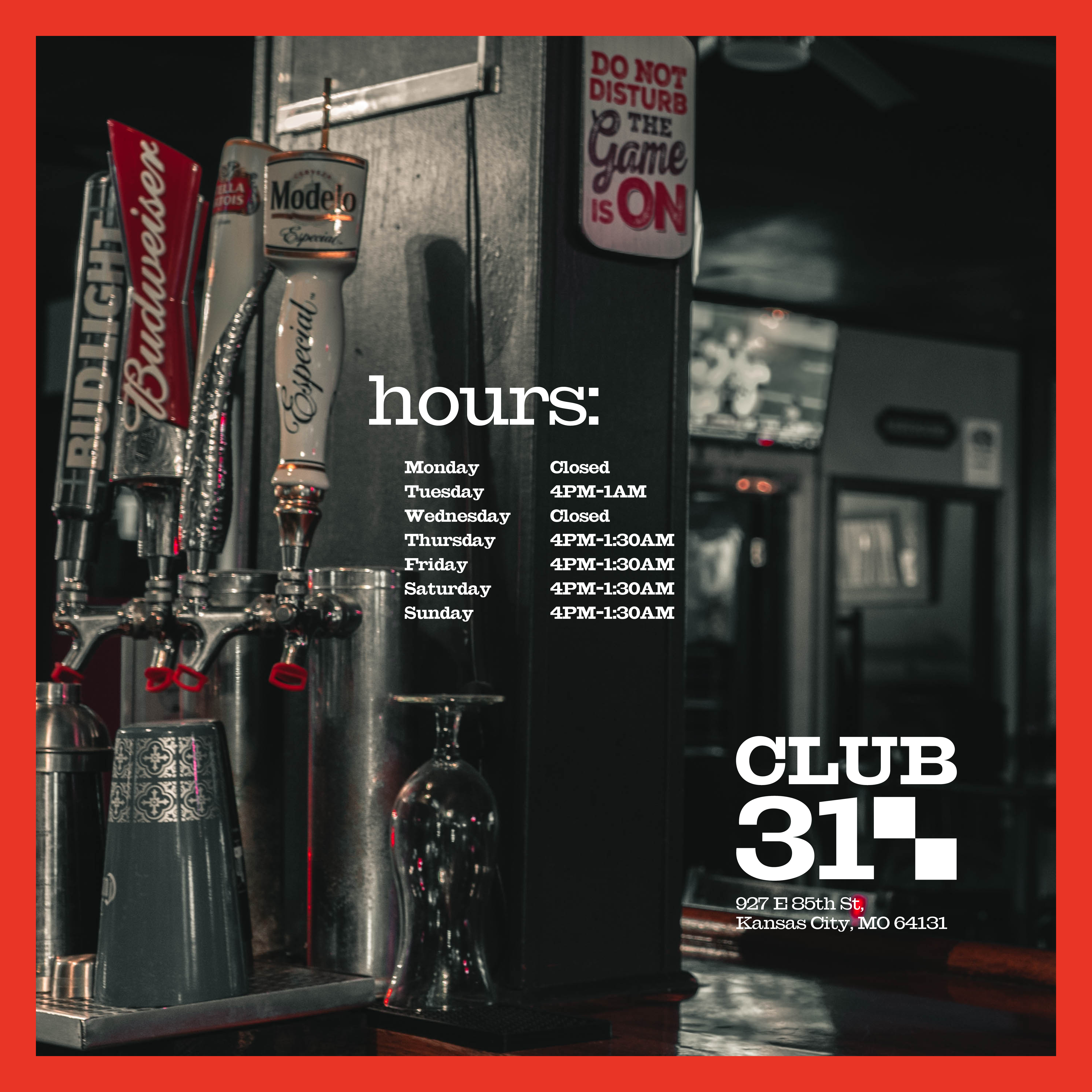

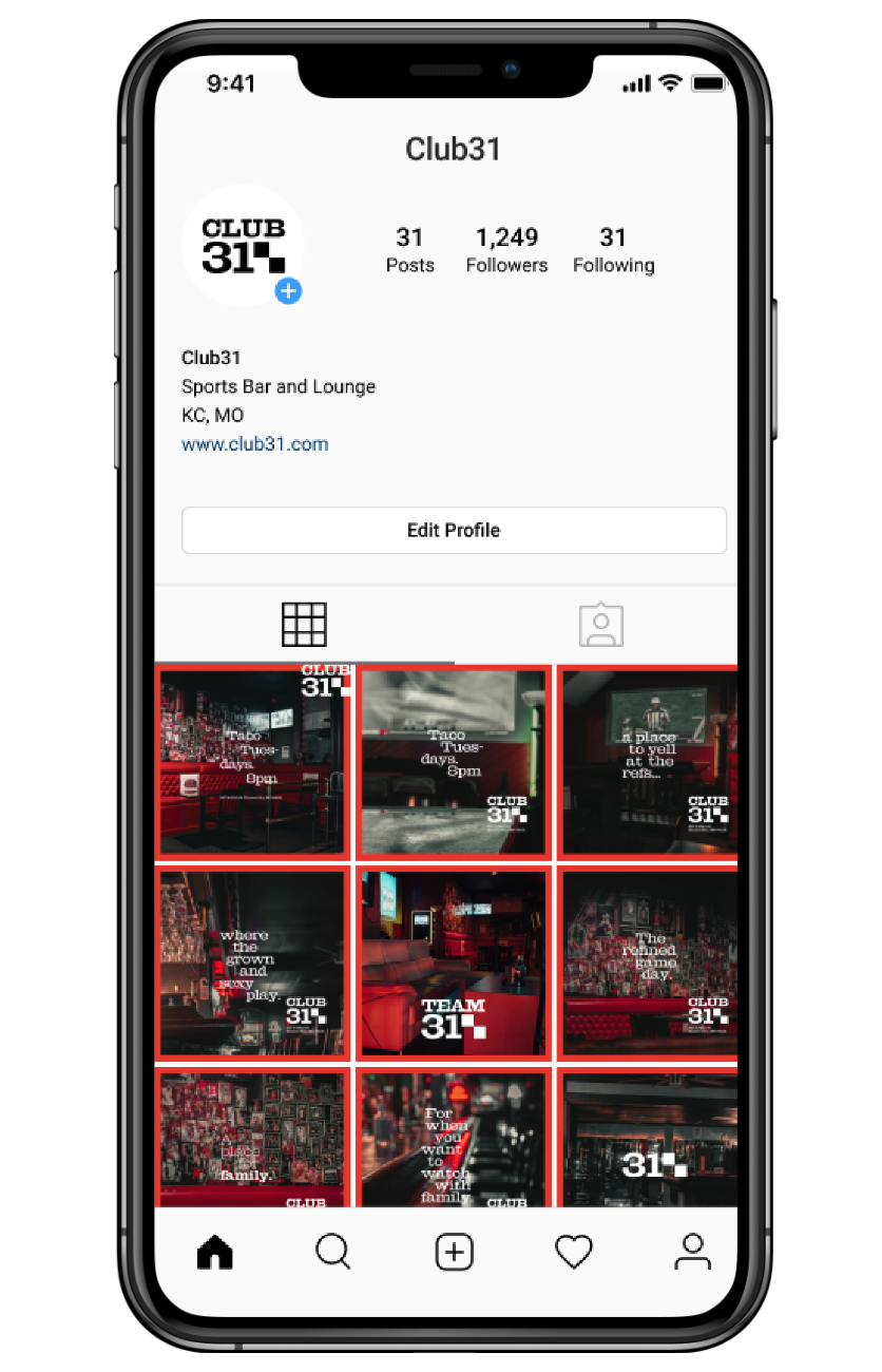


With the new brand in place, we focused on capturing the club for social media posts, advertisements, and the new website. We documented the space and designed an ad template that echoed the checkerboard pattern and established a distinctive aesthetic on social media, tying together the club's bold red branding.
A primary objective of the photography was to capture the tight-knit family atmosphere that the owner proudly presented. By employing quadratic framing, or the rule of shooting a 2x2 grid (à la Mr. Robot or Drive), we subtly referenced the checkered flag motif within the composition of the photographs, subconsciously reinforcing the brand we had created.
08 Application Testing
![]()
![]()
![]()
![]()
![]()
![]()


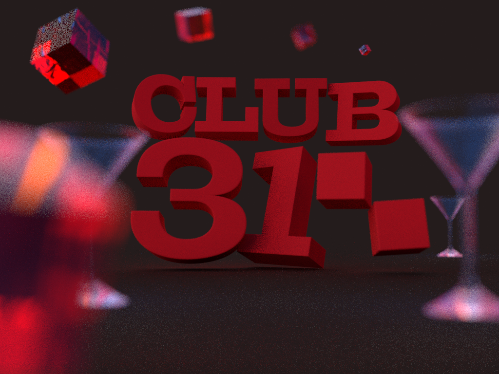
During the testing phase of the new branding, we explored various treatments to provide the client with a diverse range of options. From 3D models and additional neon signage to social media mockups, we aimed to ensure that the chosen branding elements would thrive across multiple settings. This comprehensive approach allowed us to demonstrate the versatility and adaptability of the rebrand, giving the client confidence in the system's longevity and effectiveness.
09 Social Media Header
![]()
We wanted to be able to bring in updated social media headers as well that played with abstracting the checker pattern in a new direction.
10 Prelimary Research
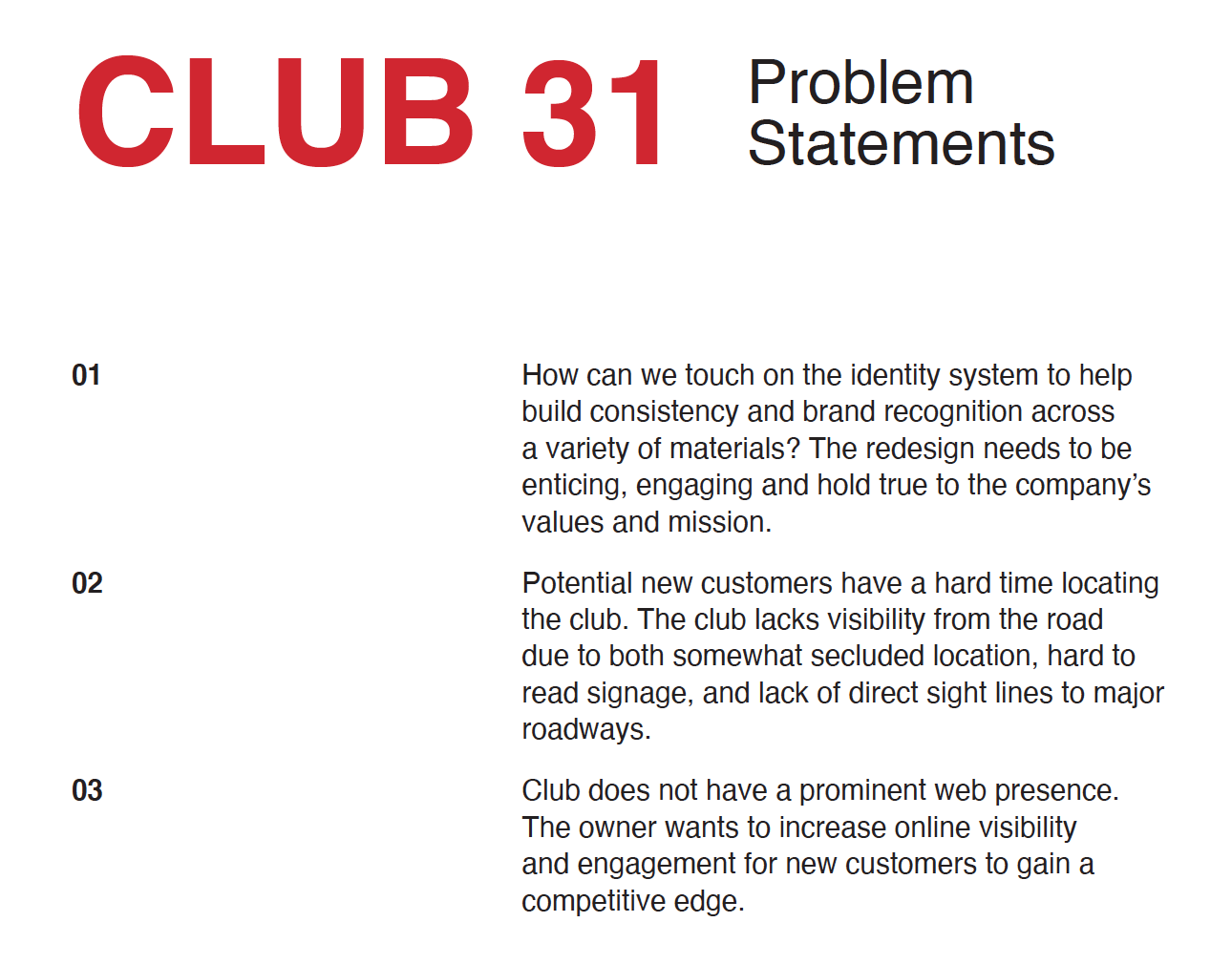

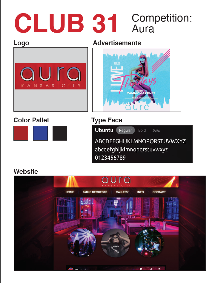
We prepared a preliminary research document for the client before beginning the branding process. This research encompassed a competitive audit of other clubs in the area, an examination of the target audience, in-depth conversations with the club owner and staff, and the identification of concrete problem statements to address the most pressing concerns faced by the club. This comprehensive approach ensured that our branding solutions were well-informed, effective, and tailored to the unique needs and challenges of the club.
︎