“the spaces between”
(2021 KCAI Exhibition)
-Drake Rorabaugh, Fiona Dougan (Her Portfolio)Website/Photography/Teasers/Social Posts
Supplemental Materials
-KCAI Class of 2021
As a member of the 2021 KCAI graphic design class, our senior exhibition presented a unique opportunity for growth as we ventured into the virtual realm. Over weeks of collective brainstorming, we refined our concept and settled on the evocative title "the spaces between," intentionally stylized in lowercase. This title encapsulated the creative synergy and connections that defined our class and our collective design journey.
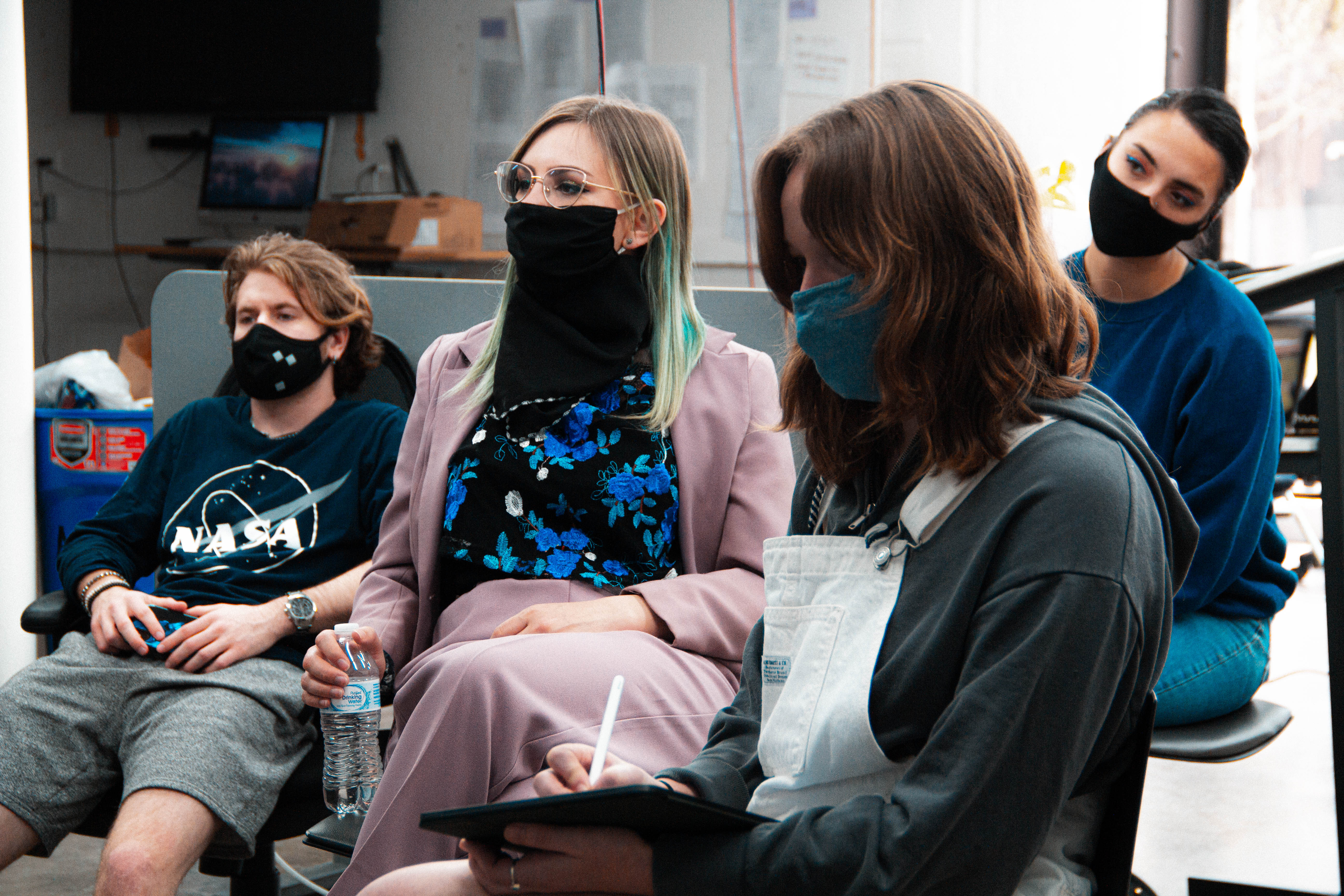
Drawing inspiration from renowned designers' copywriting practices, we crafted engaging and concise content to effectively convey our message. We divided the exhibition responsibilities among class members, assigning Fiona Dougan and me several vital tasks. Our roles included planning, designing, building, and managing the main website, ensuring seamless interactivity and a visually stunning experience. Additionally, I took the initiative to record and edit video teasers for social media and handle class photography for promotional and documentation purposes.
This ambitious project, the largest I've ever tackled, required commitment, attention to detail, and a keen understanding of design principles. The countless late nights, meticulous spreadsheets, extended Zoom calls, and persistence from me and my classmates materialized into a virtual exhibition. Despite the challenges, the experience of showcasing our designs to a broader audience as a cohesive class was immensely gratifying and unforgettable.
01 Beginning Concepting Process

When we first began concepting for the senior show, we knew that this year would look different than years past. Though the show would have to be virtual due to the pandemic, we still wanted to begin our process by thinking of the show as a physical gallery space, but move beyond the exact recreation. We thought, “What would a gallery be like with no walls, ceiling, or floor?” This led to our first navigation concept, utilizing no-clip movement and ︎"windows" that referenced individual designers or projects. We used Mozilla Hubs to communicate this idea to the rest of the class.
Some questions we still had to address were:
- How would the user navigate through different pages on the site?
- Would this type of movement work on mobile?
- Would this be too confusing for users?
Although this windows idea was eventually abandoned, it was the start of one of the concepts that became the backbone of the spaces between: the void.
02 3-D Object Interaction
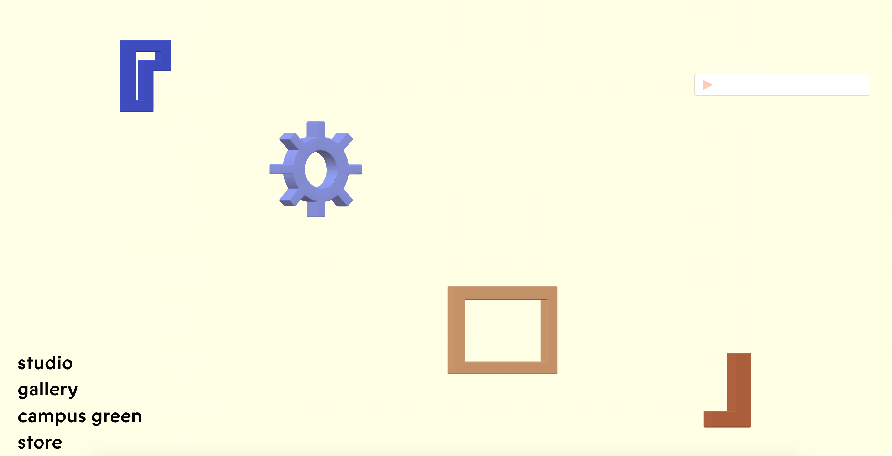

One of our top priorities for the final site was to ensure a high level of interaction. When we discovered that no-clip movement was unattainable due to our own limitations, we sought an alternative approach to transform the void into a three-dimensional space. We didn't want the site to be just another scrollable page, or a 3D room. That's when we began experimenting with 3D modeled objects, replacing the windows concept. We employed a platform called Vectary to design and host the 3D objects and integrated code into our Ready Mag site, enabling viewers to interact with each object by rotating and manipulating them.
03 Wesbite Structure


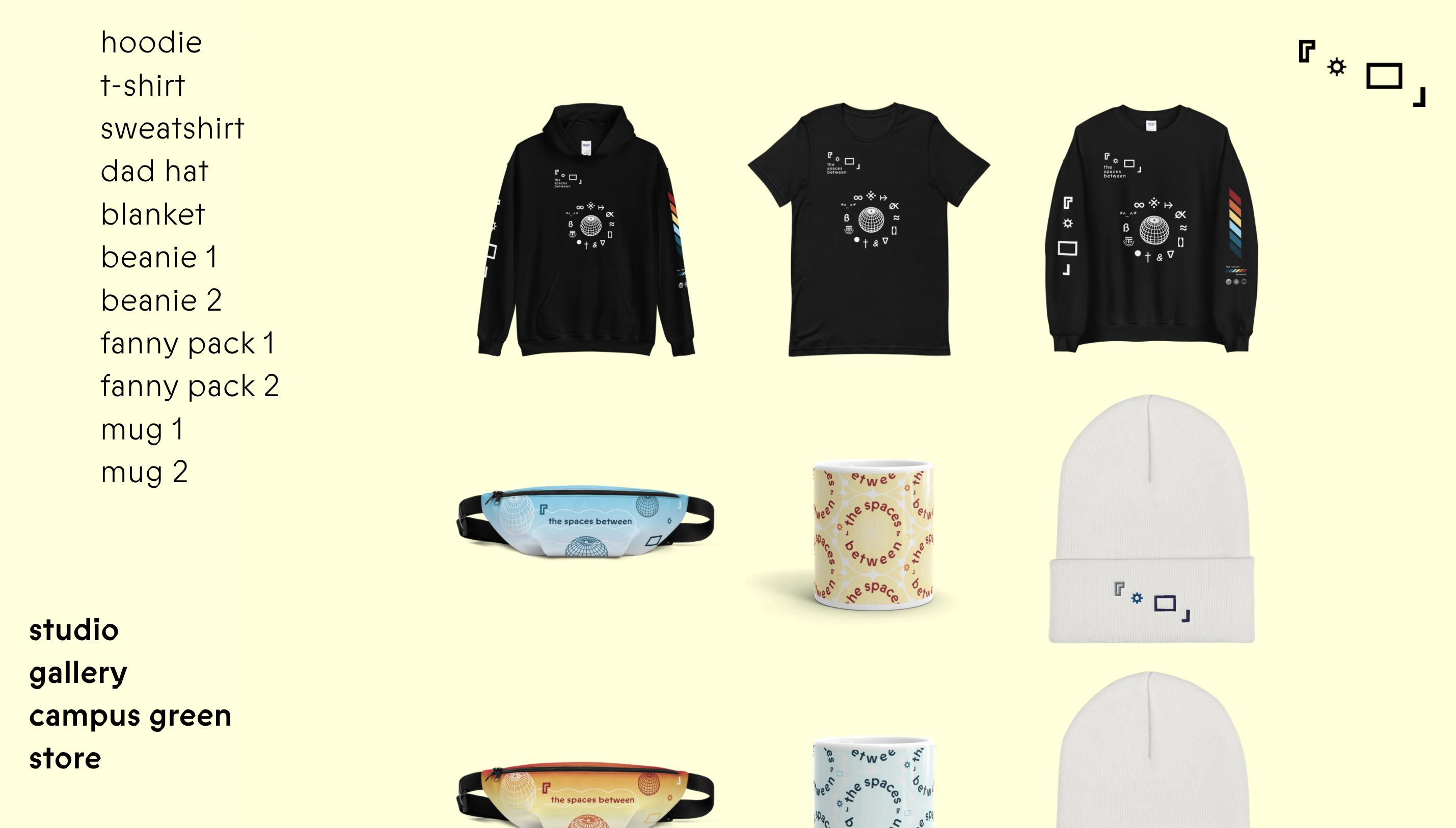

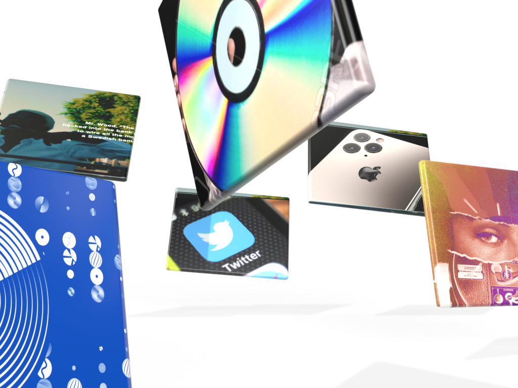
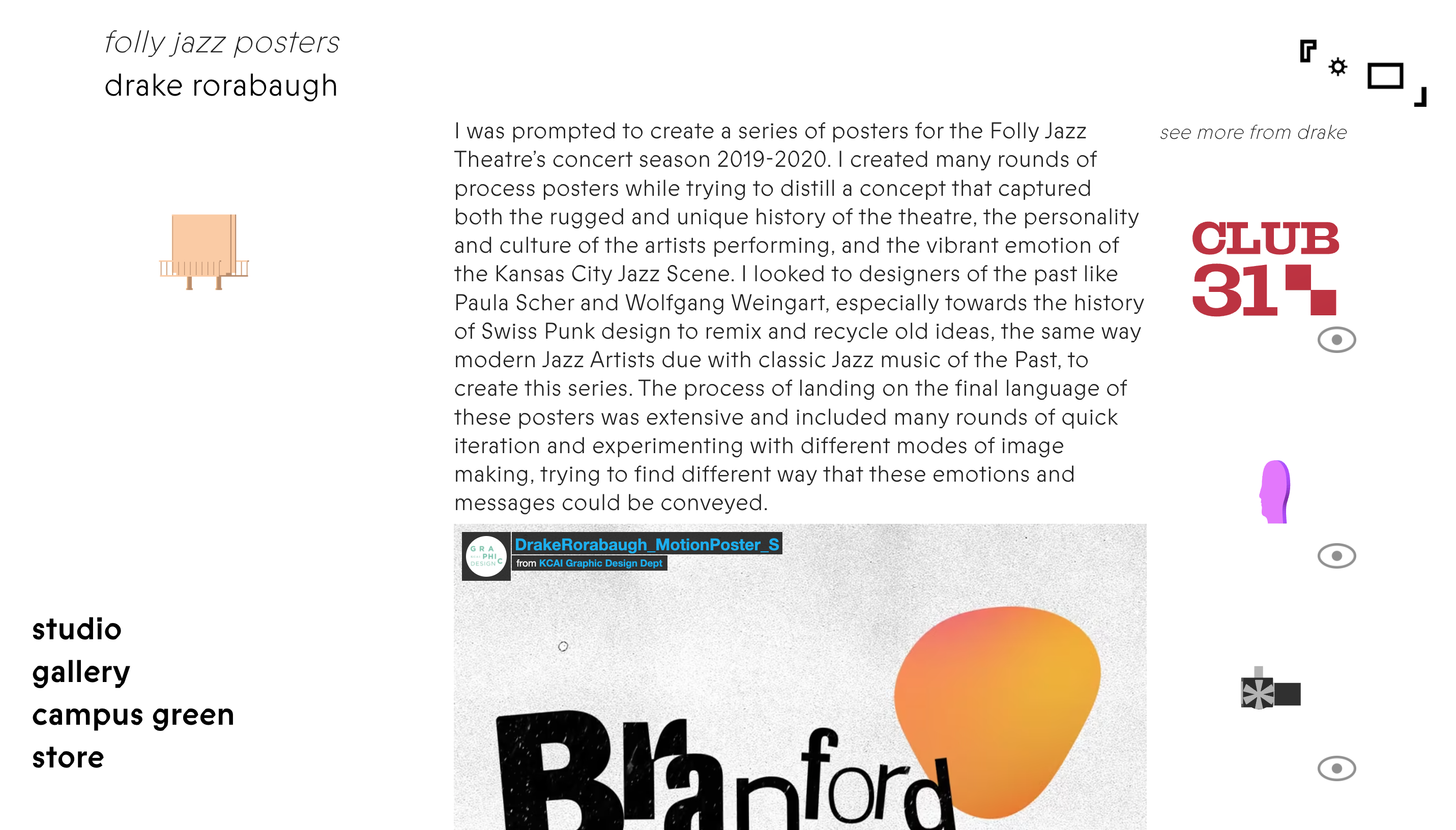
We received wireframes from another team in the class, outlining the general page structures and organization for the site. The layout included a landing page, class list page, profiles, projects, project-by-category page, store page, and a dedicated page for miscellaneous media. Next, we presented various types of 3D objects to the class and discussed their potential uses. We aimed to represent projects with these objects, but also wanted each designer to have a unique object symbolizing them on the class list page.
Considering the potential impact of heavy 3D objects on page loading times, the class collectively decided that each person would choose a glyph to represent themselves, and a low-poly style object for each of their five projects. This approach ensured a visually engaging and interactive experience without compromising the site's performance.
04 Website Building


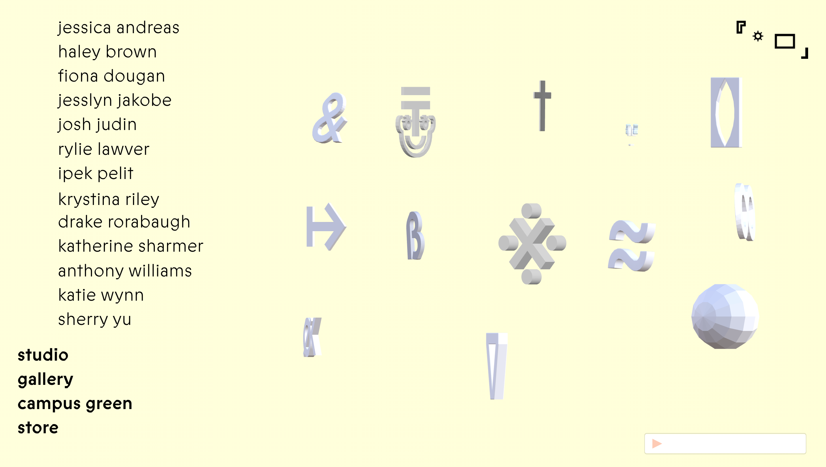
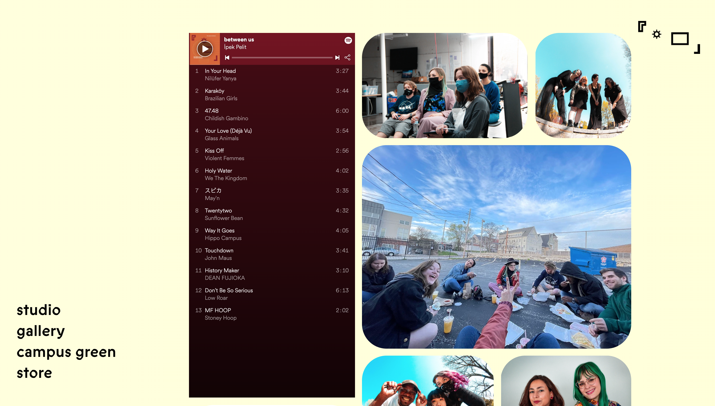
Building out the site was a huge endeavor. Besides the number of pages, there was also a ton of media on each page, especially for the projects. This required a lot of content gathering and communication with our peers. We collected all the necessary assets from every classmate and seamlessly integrated them into their respective project pages. We repeated this process for each of the 13 students across both mobile and web platforms, resulting in the creation of more than 100 pages to host the projects on the site.
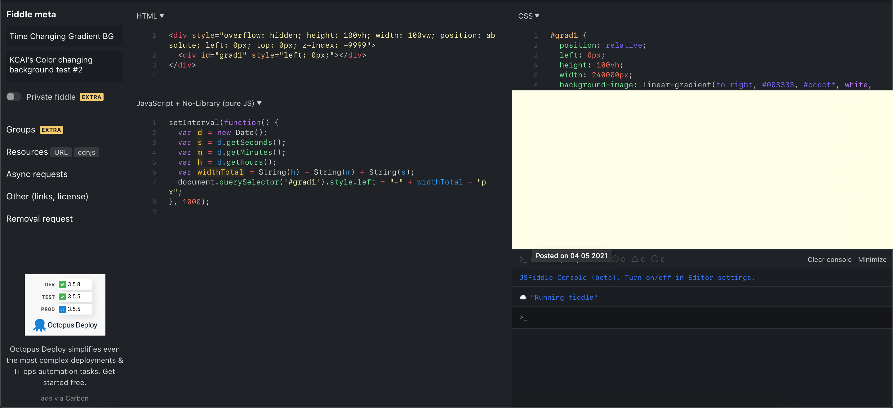
Another innovative aspect of the development process centered around programming the background to evolve over time, reflecting the natural progression of sunset and sunrise. We devised a smart object that could read the user's local time and utilize this information to move a gradient along the x-axis, repeating this cycle daily. This unique feature dynamically activated the color palette, providing an engaging and immersive user experience.
05 Teaser Videos
The goal was to develop a series of teasers that would conceptually connect to the show through carefully selected audio clips, while maintaining an air of mystery to captivate a broad audience. The aim was to differentiate this element from other shows, showcasing the unique approach taken for this particular graphic design school exhibition.
Naturally, this called for incorporating the iconic David Lynch interview as a starting point, setting the stage for a truly distinct and memorable presentation.
06 Photography
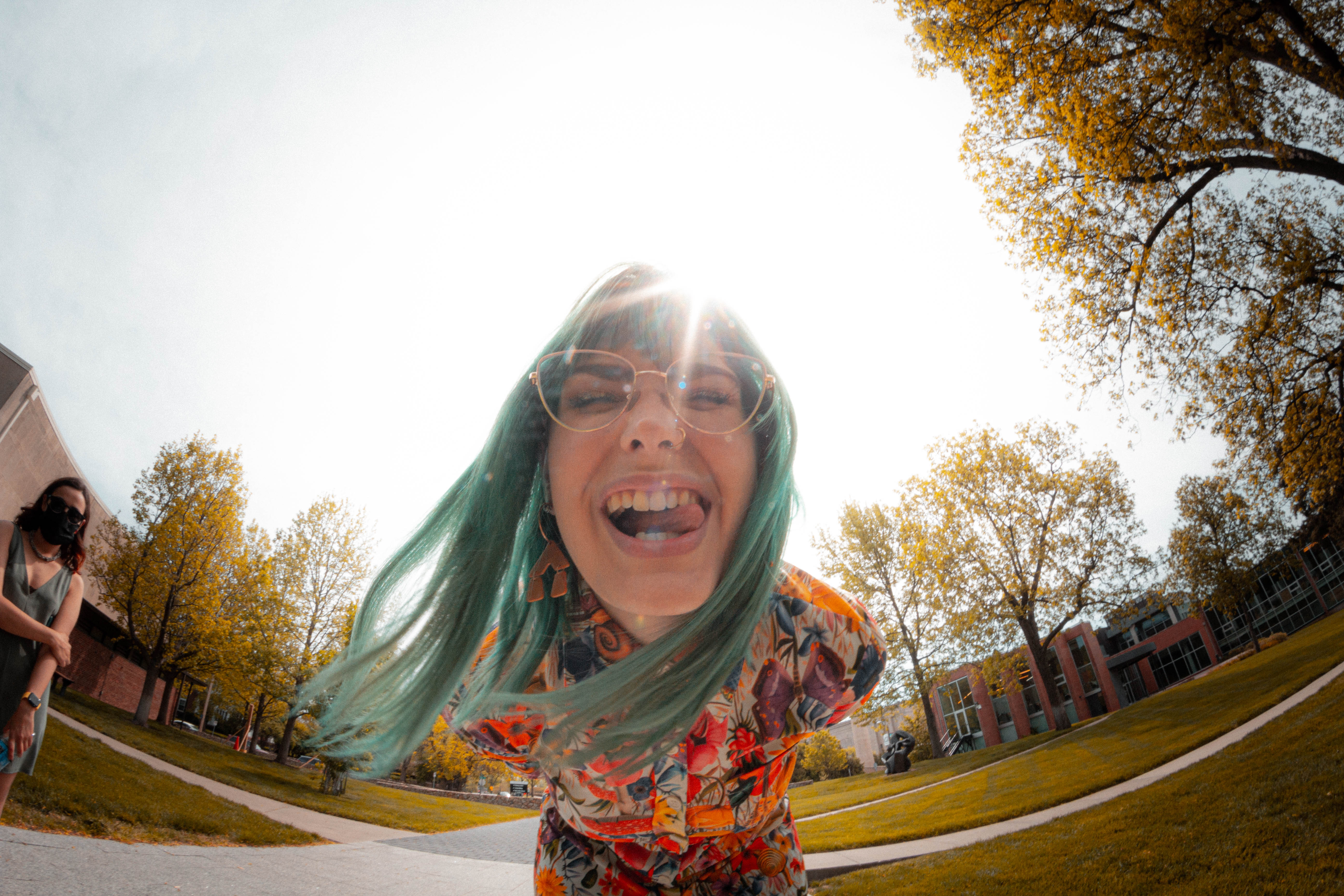

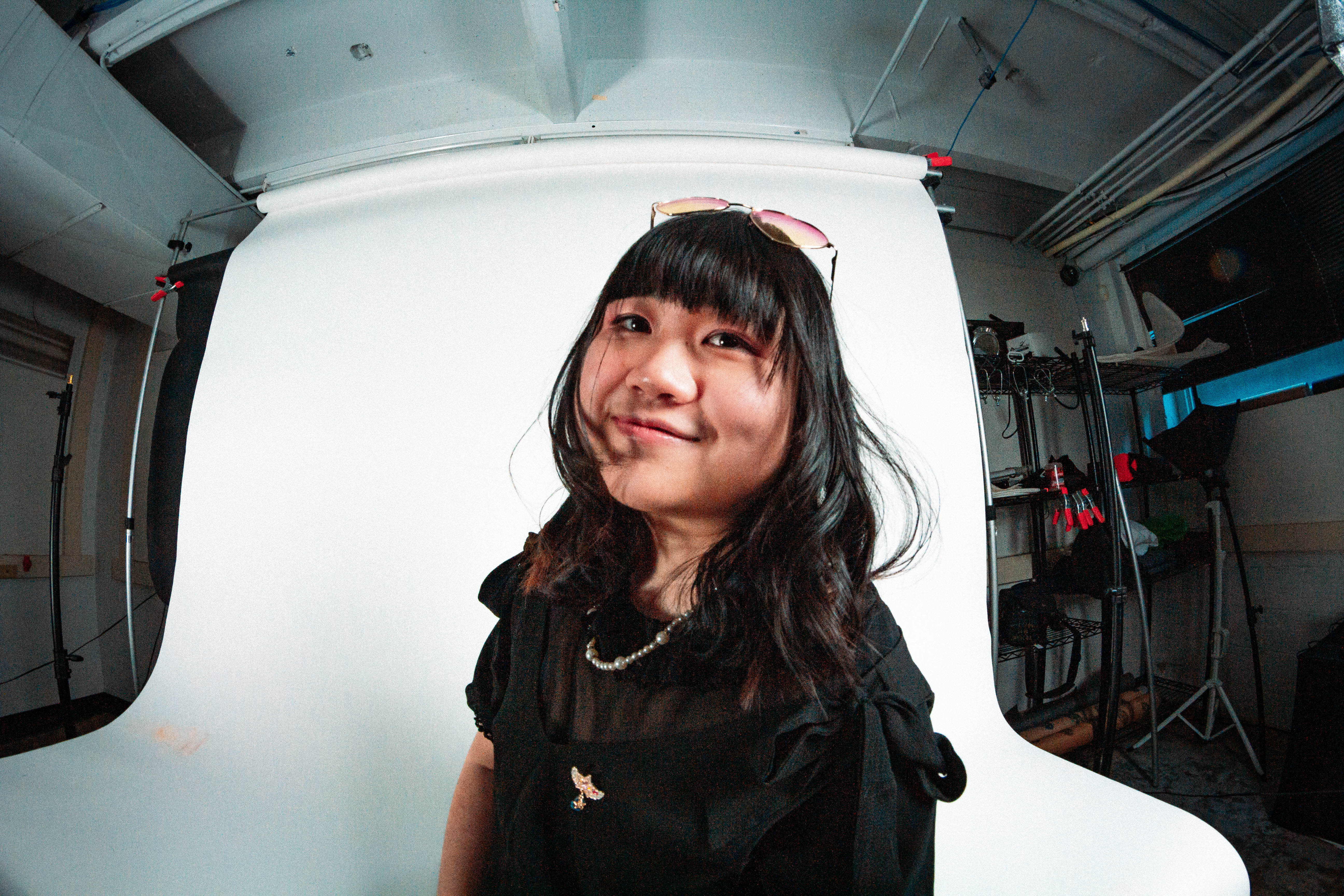

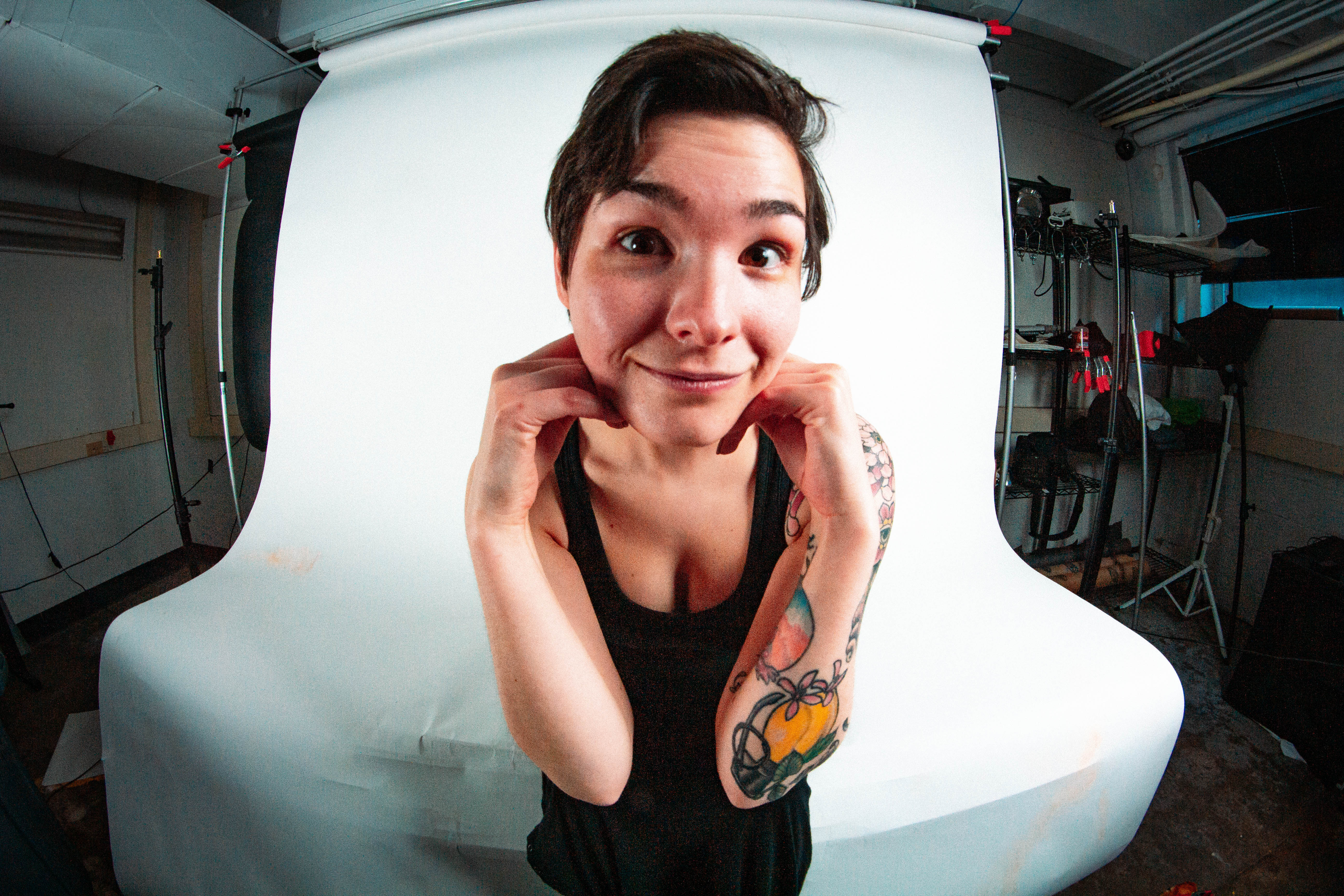


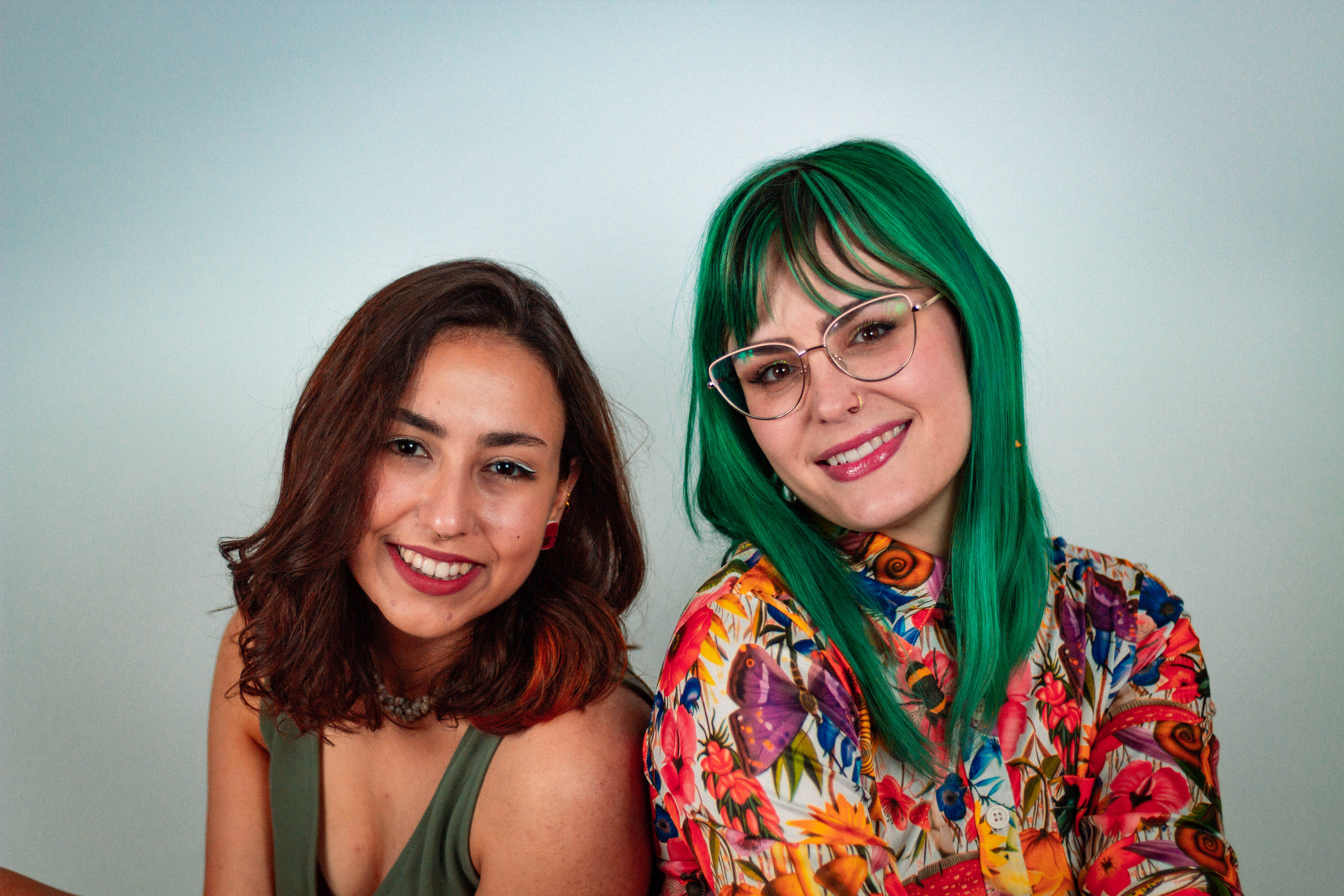
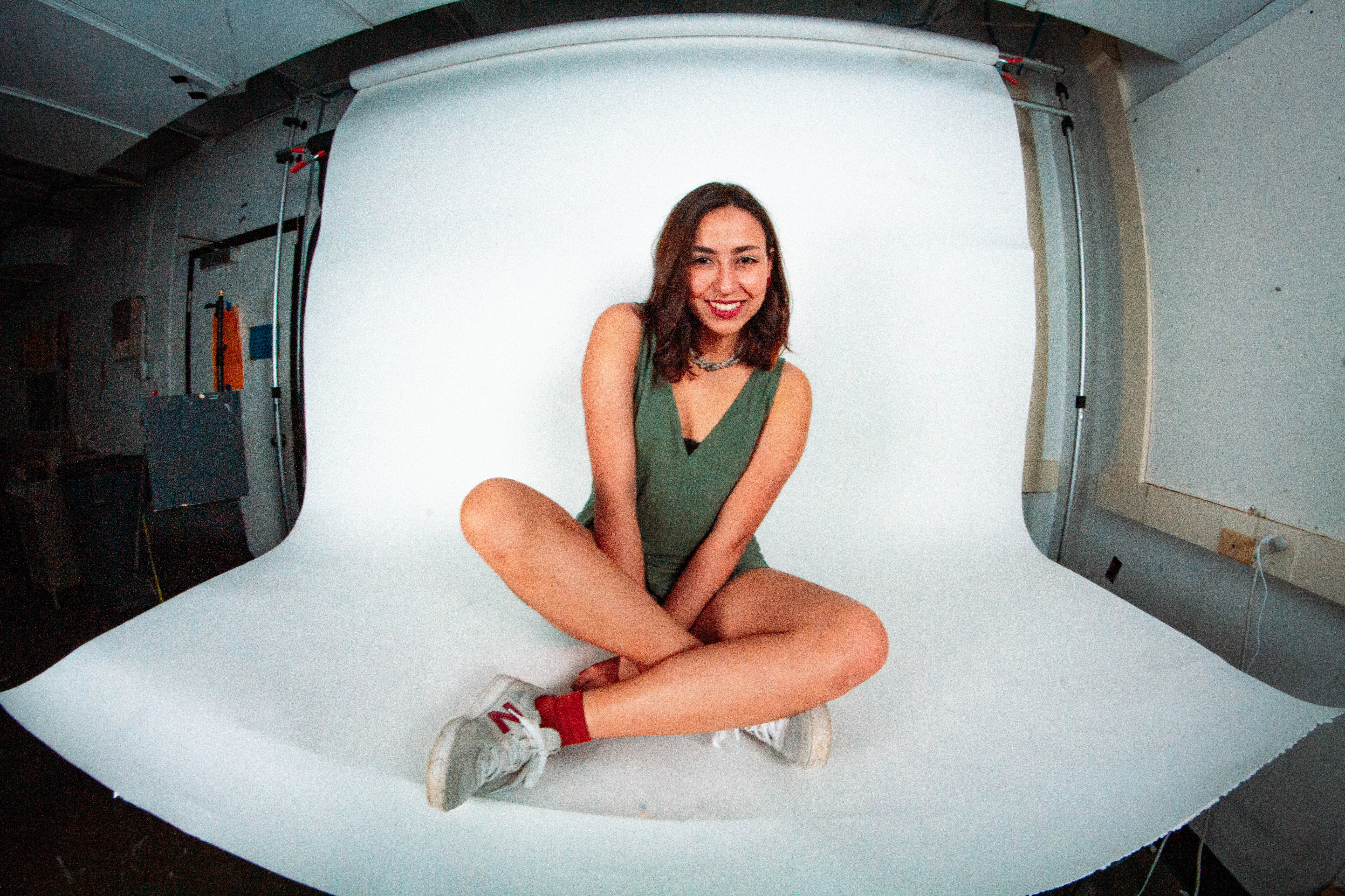

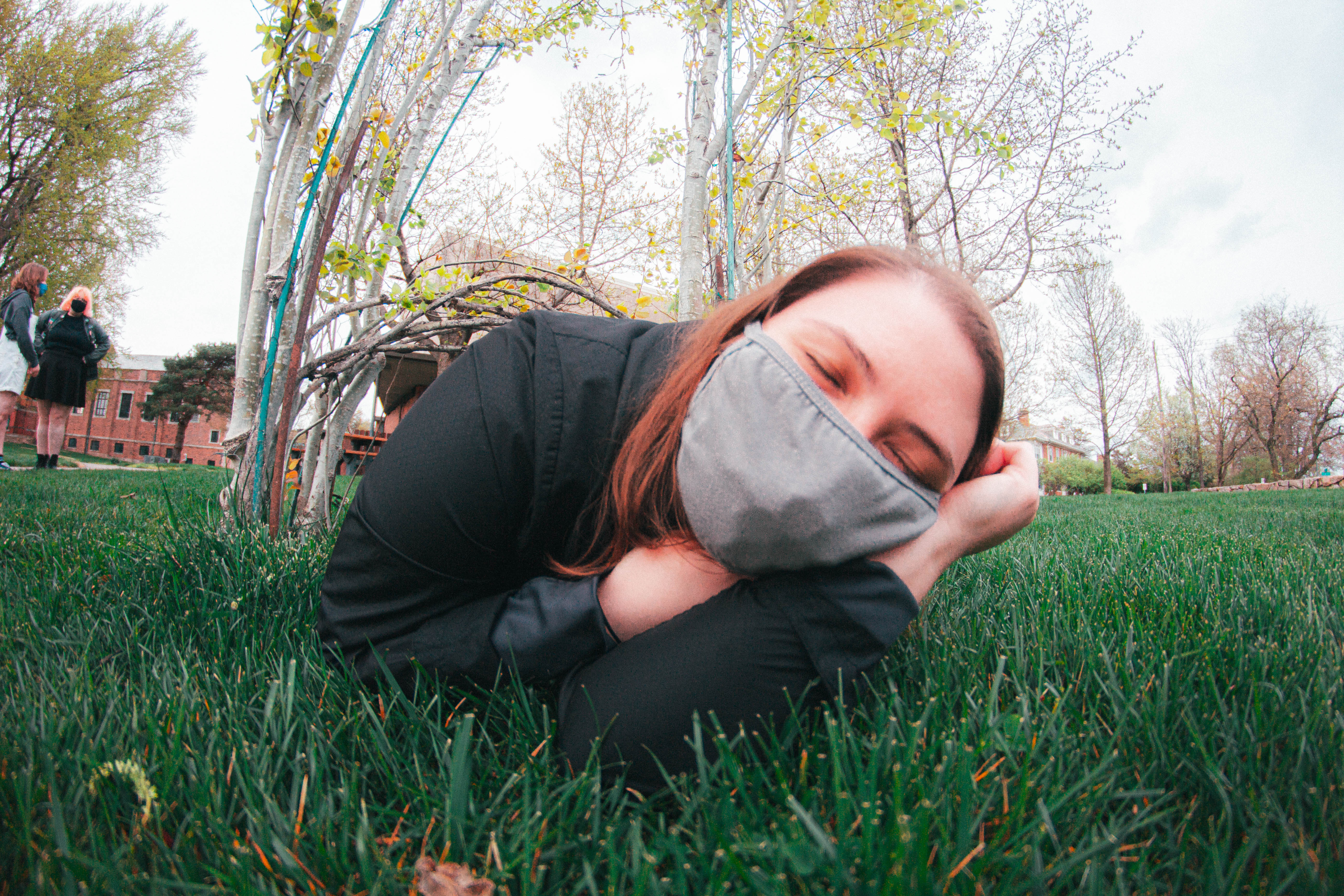
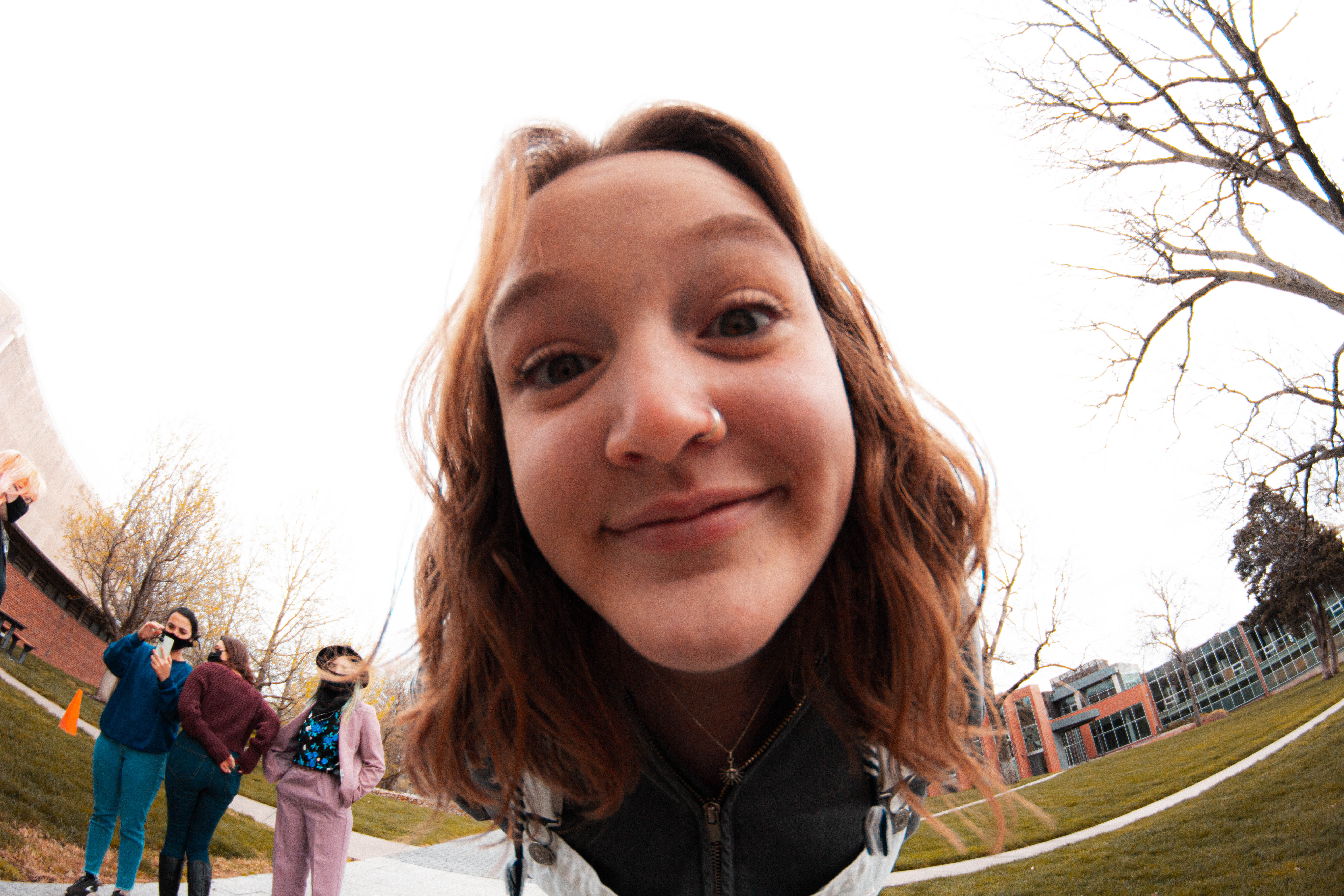


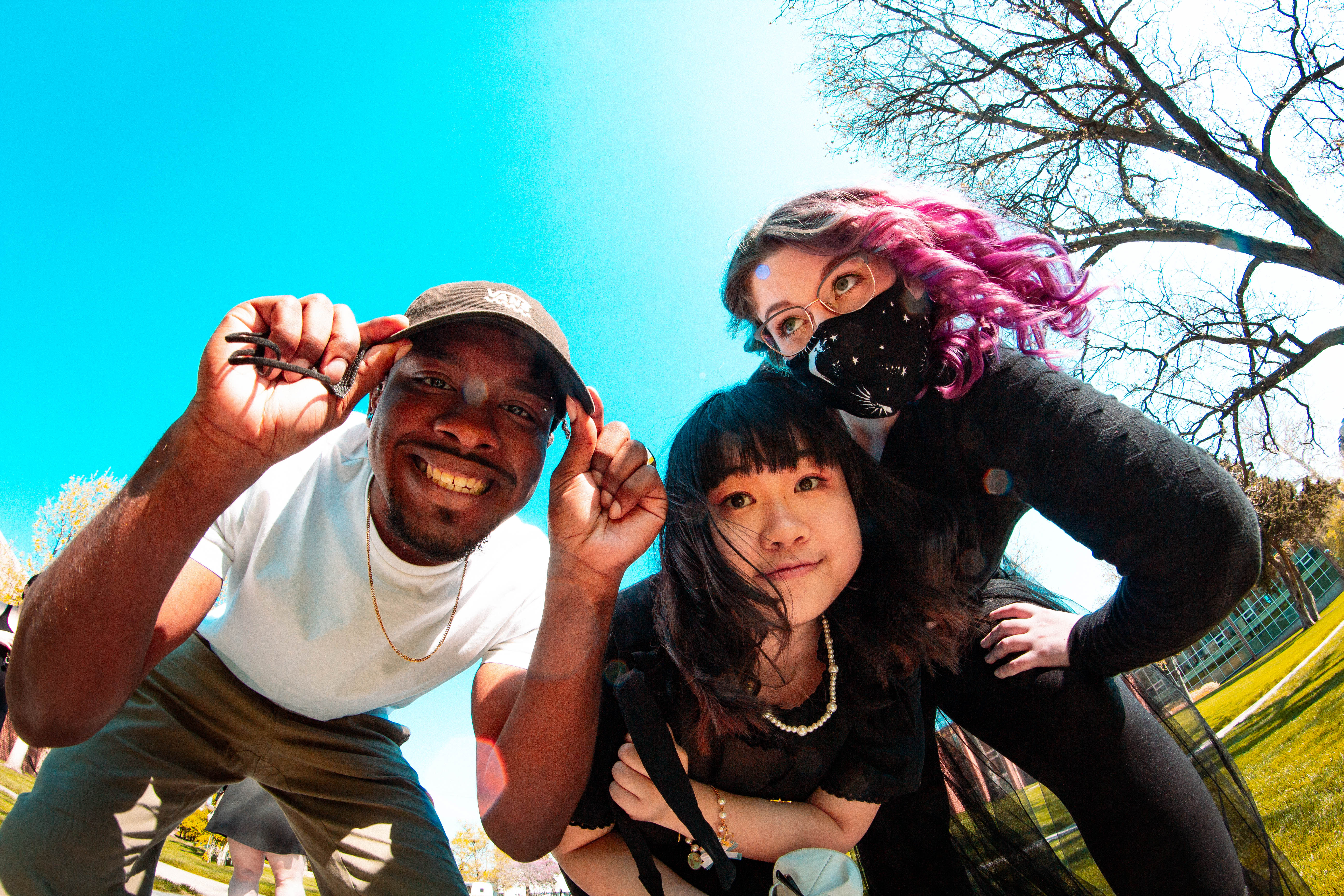
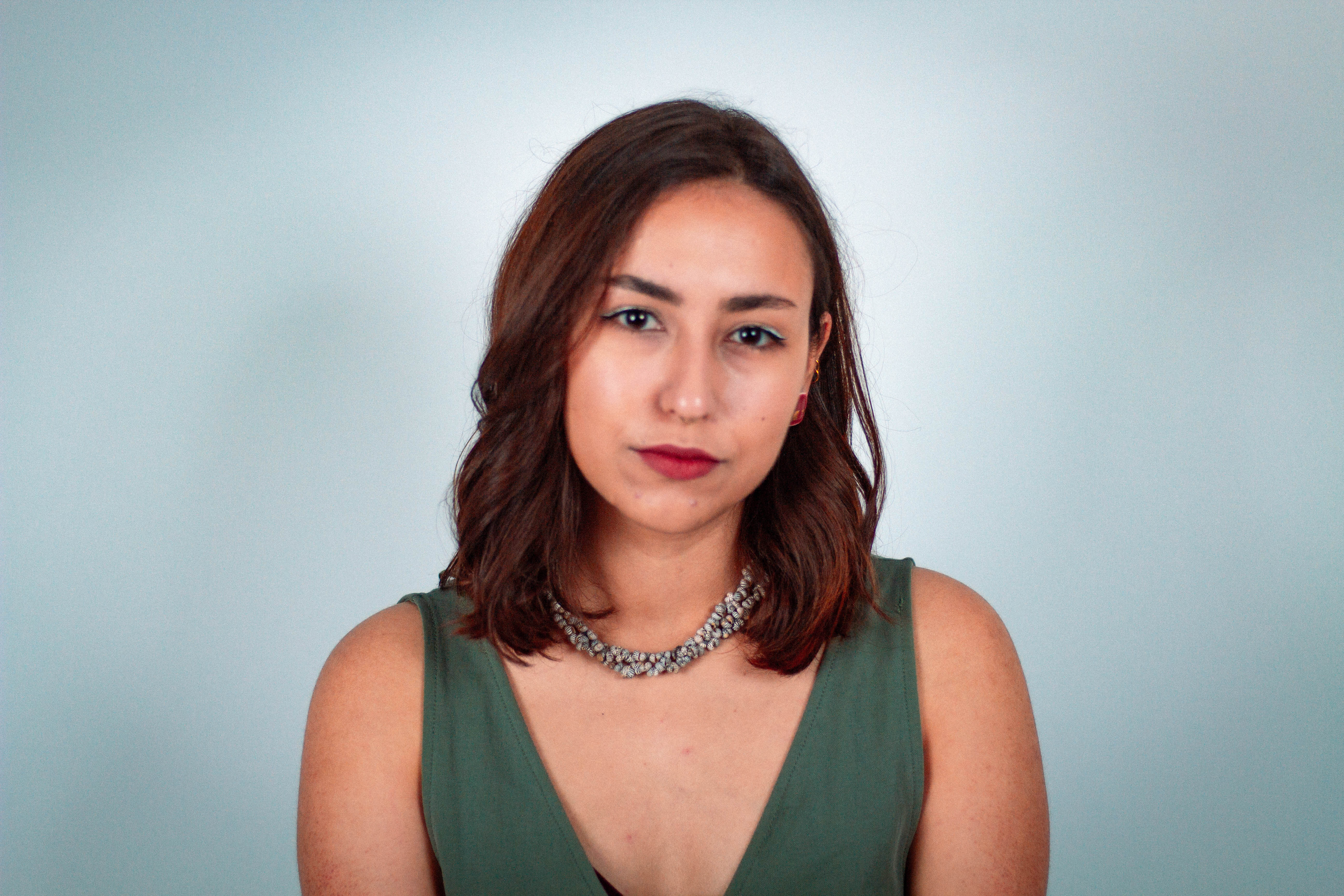
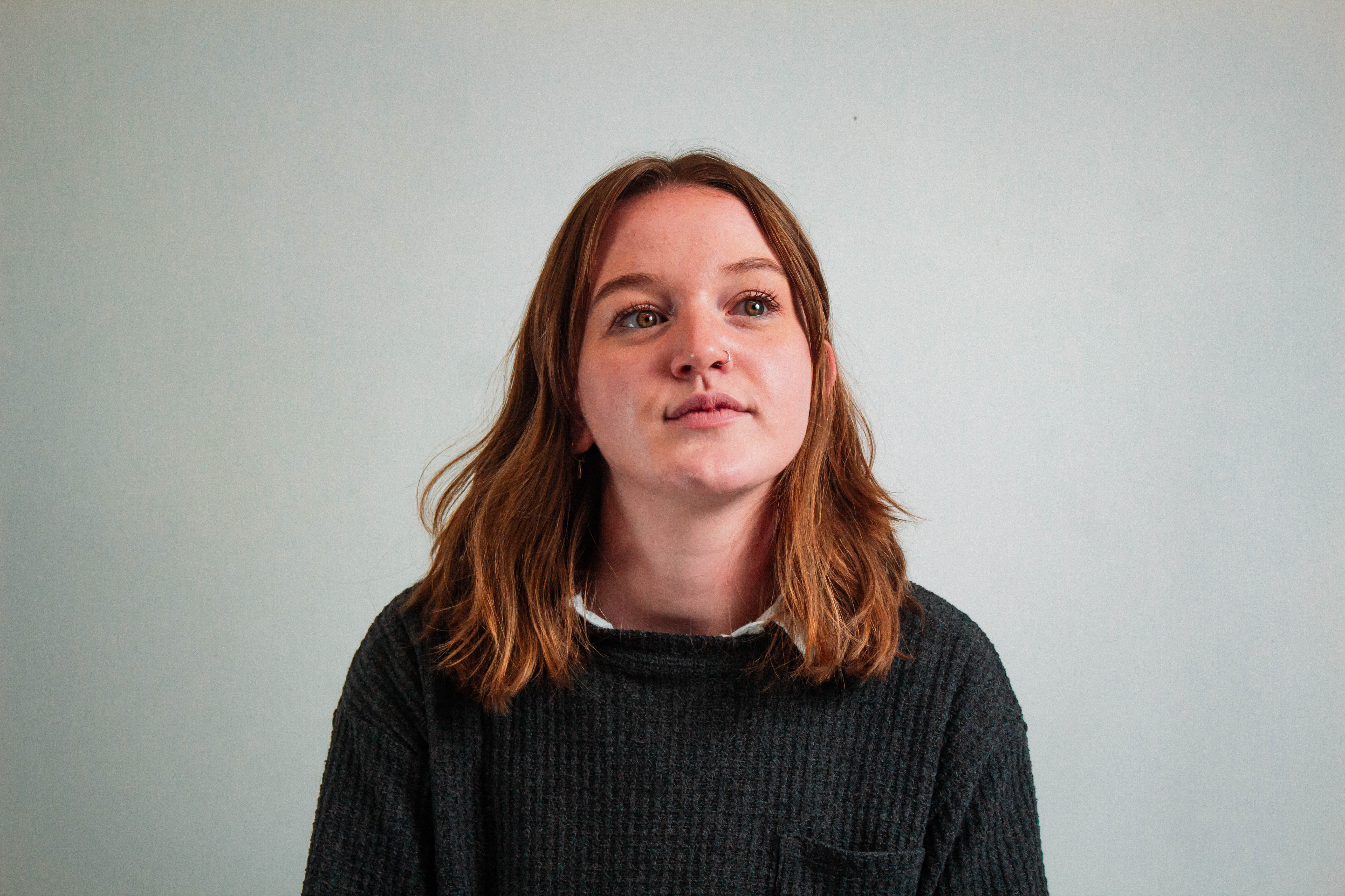


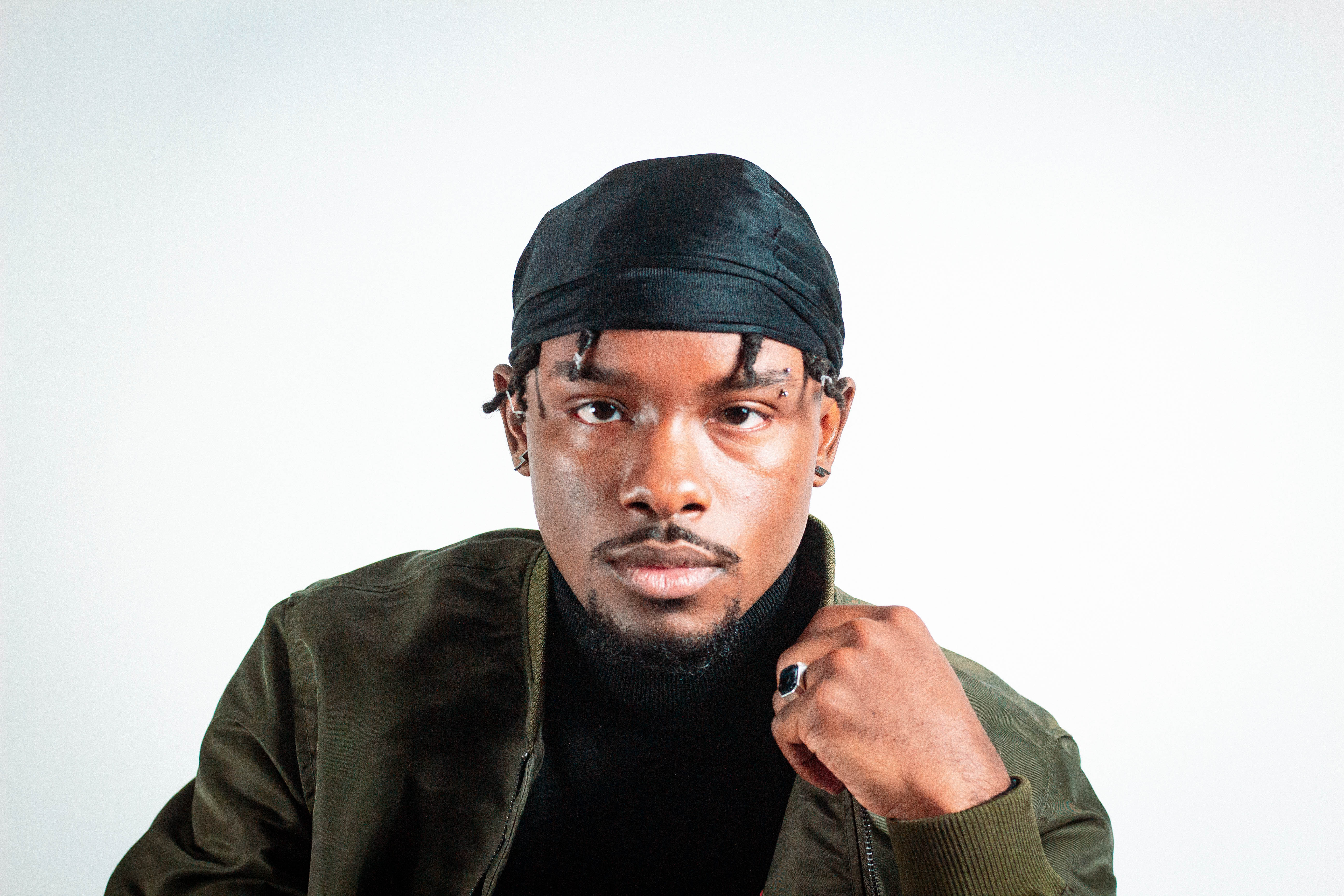
Having observed KCAI senior portraits for four years, there had been ample time to plan a unique approach for this project. To echo the void motif and differentiate these portraits from others, the decision was made to utilize a fisheye lens with exaggerated foreshortening. The editing treatments would incorporate the bright color palette and tones featured in the teasers, creating a cohesive visual identity while setting these senior portraits apart from the rest.
︎